Explore how to deliver personalized insights without losing the bigger picture.
This post is part two of a series on Power BI security patterns. Check out part one for a beginner-friendly overview of row-level security in Power BI.
This post will take our security design pattern one step further.
While row-level security (RLS) allows us to restrict data based on user roles and identities, there are times when we don’t want everything locked down. Occasionally, users need to see their data in relation to broader metrics, such as company-wide totals or averages.
In the sample report, regional sales teams should see detailed information only about their assigned region and the total sales for other regions.
In the previous post, we noted that standard RLS filters out other regional sales, preventing the totals from other regions from being displayed. This is where partial RLS becomes useful and can fulfill this requirement.
In this post, we will walk through:
What Partial RLS is and when to use it
A real-world scenario that calls for it
Key limitations and design tips
What is Partial Row-Level Security
Row-Level Security (RLS) applies filters at the dataset level throughout the entire datamodel for a user. This means that if RLS restricts a user to view only sales data for the North America region, every visual and measure in the report will be automatically limited to data associated with the North America region.
Using RLS is effective for data protection, but it can be a limitation when a report needs to provide a broader context to the user.
With report-level filters and slicers, DAX provides functions like ALL() and REMOVEFILTERS(), which can bypass data filtering. However, DAX expressions cannot bypass RLS.
Partial RLS is a design approach in Power BI that helps mitigate RLS’s limitations when necessary. The concept involves separating secured data from summary data, allowing users to view filtered and unfiltered insights side by side.
To achieve this, we will create a summary table (Annual Sales Summary (Regional)) within our datamodel. This summary table will aggregate the total sales across all regions and will not be affected by RLS filters. It provides overall totals that offer essential context when needed, while the RLS still restricts access to detailed sales information within our sales table.
In our sample report, RLS is applied to the Region table, and the RLS filter propagates to the Sales table.
In the datamodel, filters applied to the Region table do not directly impact the rows in our summary table. This means that users can see the total aggregated sales for all regions while still having RLS filters applied to the detailed sales data.
Use Case: Display Regional Total Sales and Percentage of Company-Wide Sales
We are designing a Power BI report for a global sales team. Each regional sales team member should only be able to:
View detailed transaction-level data for their assigned region
See key metrics, like total sales for all regions, to provide a broader context
Step 1: Apply RLS rules to the Region table
First, we define our RLS rules in Power BI Desktop, see Power BI Row-Level Security Explained: Protect Data by User Role.
The implemented RLS rules filter the Sales table and limits access to the appropriate region per user.
A challenge arises when we implement RLS while also trying to meet the second requirement. As shown in the image above, the total sales figures for Asia and North America appear blank when viewing the report with the Europe role.
This is because the measure used to calculate the totals uses the following expression.
Total Sales = SUM(Sales[Amount])
When RLS is implemented, users only have access to data specific to their region. For instance, when the Total Sales measure is evaluated, the Sales table is filtered to include only the sales data associated with the Europe sales region. As a result, the Total Sales measure reflects the total sales relevant to the user’s region rather than the entire dataset.
Step 2: Create a summary table
To address this issue and meet our requirements, we will create a calculated summary table in our data model. This table will store pre-aggregated total sales and total transactions by year and region.
This table does not have a direct relationship with the Region table, which is under RLS control, and our RLS roles will not filter it.
Step 3: Build dynamic DAX measures
We can now utilize this table in our measures to establish company-wide or cross-region metrics while ensuring the security of the underlying transactional data.
We first create two new measures within our datamodel to calculate the entire company’s total sales and transaction counts.
We can use these base measures to dynamically display total sales or total transactions for all regions in the data cards at the bottom of the report, utilizing the following expression and visual filters.
Note: we can also use the fact that RLS filters the region table and expressions such as COUNTROWS() or SELECTEDVALUE() to hide or show the top performers data card.
RLS still applies to the top-row visuals and bar charts, which provide detailed breakdowns of regional sales. However, the summary table enables us to present the total sales for all regions within the data card along the bottom of our report.
Step 4: Combine RLS-filtered and unfiltered measures
The non-RLS base measures can also compare regional total sales or transactions based on the current user (RLS-filtered) as a percentage of the company-wide measure (unfiltered).
% of CompanyWide Sales =
DIVIDE([Total Sales], [Total Sales (nonRLS)])
Considerations and Limitations
While the partial RLS pattern can enhance the usability and insightfulness of our Power BI report, we must consider its capabilities and limitations, as well as the associated technical and design trade-offs.
Partial RLS does not override existing RLS filters; instead, it isolates high-level summary data in a separate table unaffected by these filters. This allows partial RLS to be used for comparisons or to add additional global context without exposing detailed row-level information.
1) When implementing partial RLS, it’s important to remember that datamodel relationships matter. The summary table must be included in the datamodel to ensure that cross-filtering from tables affected by RLS does not impact it. If the summary table is related to a table with RLS filters applied at the datamodel level, it will also be subject to the RLS filters.
2) When combining measures filtered by RLS with unfiltered measures, users may need assistance interpreting the visuals associated with these measures. Visual cues or proper labeling, such as Total Sales Across All Regions versus Your Regional Sales may be necessary to help clarify what users are seeing.
3) Partial RLS can be implemented efficiently when the summary table is small and pre-aggregated without complex DAX filtering. However, keep in mind that if the summary table grows too large or includes too much granularity, it may negatively impact the performance of our reports.
4) Implementing partial RLS can add complexity when creating DAX measures. Since RLS is enforced on our Sales table, any attempts to calculate totals, even when using functions like ALL() or REMOVEFILTER(), will still be subject to our RLS rules. While partial RLS offers additional insights into our data, it does not grant any additional access.
5) We must assess edge cases, such as data gaps or undefined user roles. If a user is assigned a role that is not properly mapped in our datamodel, they may encounter an empty report or access to detailed data. We should always validate our RLS roles to ensure they function as expected.
Wrapping Up
Partial RLS is a design approach used in cases where RLS filtering restricts our ability to give users a broader context for their data. This approach allows us to ensure secure access to detailed, role-specific data while providing users insight into the overall picture and how their data fits into a larger context.
We can provide contextual insights without revealing specific row details by utilizing partial row-level security, enabling us to create more comprehensive and insightful reports.
Row-Level Security (RLS) enables us to filter data at the row level, but it does not allow us to secure entire tables or columns within our datamodel. Make sure to check back for the next post, or better yet, subscribe so you don’t miss it!
In the next post, we will explore Object-Level Security (OLS) in Power BI. OLS is essential because it allows us to secure specific tables and columns from report viewers.
If you’d like to follow along and practice these techniques, Power BI sample reports are available here: EMGuyant GitHub – Power BI Security Patterns.
Thank you for reading! Stay curious, and until next time, happy learning.
And, remember, as Albert Einstein once said, “Anyone who has never made a mistake has never tried anything new.” So, don’t be afraid of making mistakes, practice makes perfect. Continuously experiment, explore, and challenge yourself with real-world scenarios.
If this sparked your curiosity, keep that spark alive and check back frequently. Better yet, be sure not to miss a post by subscribing! With each new post comes an opportunity to learn something new.
Discover how to personalize your reports and show each user only the data they require in just a few clicks.
When creating reports for teams across various departments or regions, it’s important to recognize that not everyone needs or wants to see the same data. This is where Row-Level Security (RLS) becomes essential.
We can use RLS to restrict data access for report viewers based on their identity. This eliminates the need to create separate reports for different departments or regions. With RLS, we can use a single report and dataset to generate personalized views for each individual or role.
In this guide, we will walk through:
What RLS is and why we should use it
Static vs Dynamic RLS
Step-by-step examples for each
Limitations and Considerations when implementing RLS
By the end of this guide, you will better understand RLS, its applications, and its limitations. Additionally, a PBIX example file will be provided for in-depth, hands-on exploration of this topic.
What is Row-Level Security
Row-level Security (RLS) within Power BI restricts data access for report viewers based on their identity by enabling us to establish rules within our data model to filter data rows.
Consider it as always adding another filter to the appropriate users. These filters are applied at the dataset level, ensuring that users can only see the information they can access, regardless of how they interact with the report
It is important to note that users who have more than viewer permissions to the Power BI workspace have access to the entire semantic model. RLS only restricts data access for users with Viewer permissions.
Why use Row-Level Security
There are several key advantages to using Row-Level Security (RLS) when creating our reports.
Security and Privacy
RLS helps prevent users from seeing data they shouldn’t have access to. This can become especially important when the dataset includes sensitive data.
Efficiency and Scalability
Managing separate reports for different departments or roles can be cumbersome. With RLS, we can create and customize one report for each user role. This approach is easier to maintain, scales better, and reduces the likelihood of inconsistencies and errors.
Improved User Experience
Users no longer need to apply slicers or filters to view only their data of interest. RLS automatically handles this when the report is rendered, resulting in a cleaner and more user-friendly report.
Static Row-Level Security
Static Row-Level Security (RLS) is the most straightforward form of RLS. In this approach, we manually define which users can access specific rows of data, usually by applying filters based on criteria such as Region or Department. This method works well when there is a small group of users and the access rules do not change frequently.
Step-by-Step: Static RLS
Static RLS applies a fixed value in the DAX filter when rendering our report. Configuring static RLS involves several steps.
1. Creating RLS roles in Power BI Desktop To create RLS roles in Power BI Desktop, navigate to the Modeling tab and select Manage Roles.
Then, we select + New under Roles on the manage security roles dialog box. For this sample report, we create a role for each sales region.
We give each role a descriptive name, select the table to which the filter is applied, and create the filter condition.
After each role is created, any user we assign to the Asia, Europe, or United States role will only see data filtered to that specific region.
This approach is considered Static RLS since we use a static value to define each role.
2. Testing the roles in Power BI Desktop Within Power BI Desktop, we can test each role to validate it by selecting the View as option on the modeling tab.
After selecting a role, we can see the report rendered as if we are a member of that role.
3. Deploying the report to the Power BI Service Once we create and validate the roles, we publish the report to the Power BI Service as with any other report.
4. Add members to the role in the Power BI Service To add a member to the role in the Power BI Service, we must navigate to the workspace where we published the report. We locate the semantic model and select the More options ellipsis (…) and then Security.
Within the Row-Level Security screen, we add users or security groups to each role we created. RLS rules will not apply to users who have access to the report but have not been added to a role.
5. Testing the roles in the Power BI Service On the Security screen, we select the More options ellipsis (…) next to each role and then Test as role.
Once all roles have been validated, we have successfully implemented static row-level Security in Power BI.
Dynamic Row-Level Security
While static RLS can be great for smaller teams, it doesn’t scale well. Manually assigning roles to individuals quickly becomes unmanageable.
Dynamic RLS solves this issue using a User Access Table or a field that defines each user’s role inside our data model. The report utilizes this table to filter itself based on who is viewing the report.
For this example, our data model has an Employee table that contains each employee’s user principal name and role (e.g., Asia Sales, Europe Sales, US Sales, Management, or blank). We utilize this information to implement dynamic RLS by looking up the user’s role based on the user principal name of the viewer currently signed in.
Step-by-Step: Dynamic RLS
1. Set up a dynamic role using DAX Navigate to the Modeling tab and select Manage Roles. Then, in the Manage Security Roles dialog box, select + New under Roles.
We name the role, select the table to which the filter is applied, and, this time, rather than creating a static filter condition, select Switch to DAX editor to create our dynamic rule.
We filter the Region table based on the current user’s role using the following DAX expression:
The DAX expression looks up the user’s Role based on the current user’s user principal name (e.g. email).
2. Testing the dynamic filter After creating the rule, we must test and validate that it functions as expected. We navigate to the Modeling tab and select View as. Then, in the dialog box, we check the Other User option and enter a user’s email. We also check the dynamic filter rule we just created and select OK.
The report will refresh, and we will validate that the TEMP-UPN-2 user, who has the role of US Sales, sees data only for their assigned region.
3. Publish the report and add members to the role We publish the report to the Power BI Service. Then, to add members to the role in the Power BI Service, we must navigate to the workspace where we published the report. We locate the semantic model and select the More options ellipsis (…) and then Security.
Within the Row-Level Security screen, similar to what we did for static RLS, we can add users or security groups to each role we created.
Since we may implement dynamic row-level Security for better scalability, assigning a security group when adding members can be beneficial. Better yet, this security group can also give users their Viewer access to the report or app.
4. Validate roles in the Power BI Service On the Security screen, we select the More options ellipsis (…) next to each role and then Test as role.
Then, at the top, we select Now viewing as and Select a person to validate that the RLS is functioning as expected. We will view the report as Jasper (TEMP-UPN-2) as we did in Power BI Desktop.
Note: The TEMP-UPN-# provided in the sample file will only function for testing in Power BI Desktop without requiring an actual email address. The UPN field must contain actual user email addresses to validate in the Power BI Service.
We can also validate the report for Diego (TEMP-UPN-4), who is assigned the Management role and should be able to see data for all sales regions
One last consideration is what happens when a user intentionally or unintentionally has access to view the report but does not have a Role defined in the Employee table.
If we review the DAX expression used for the filter:
The last value, or the default if no other condition is true, is set to FALSE(). This means that if a user is in the Employee table but either does not have a role or their role doesn’t match one defined in the rule, the report will be empty.
When testing the report, Grady (TEMP-UPN-5) is contained in the Employee table but does not have a role assigned.
Now that everything is working as expected, we have successfully implemented dynamic row-level Security. The benefit is that by using dynamic RLS, we replace four roles with a single rule applied dynamically based on the current user. Additionally, we can add an extra layer and hide data for users who have access to the report but are not assigned a role in the Employee table.
Considerations and Limitations
Before implementing RLS across our reports, it is important to consider and evaluate the impacts of RLS limitations.
A list of limitations can be viewed here:
It’s also important to understand when Row-Level Security (RLS) is and is not the right tool.
We may consider publishing multiple semantic models if we have only a few simple RLS rules. For example, if we have just two sales regions, we might publish a separate semantic model for each region. Although the semantic models do not enforce RLS, we can use query parameters to filter the source data to the specific sales region. The use of query parameters would still allow us to publish the same model while displaying the relevant data for each region.
Advantages of not using Row-Level Security (RLS) include:
Improved Query Performance: With fewer filters applied to the data model, queries can run faster.
Smaller Models: While avoiding RLS may increase the number of models, each individual model is generally smaller, which can enhance query performance and data refresh responsiveness.
Full Access to Power BI Features: Certain features, like “Publish to the Web”, do not work with RLS.
However, there are also disadvantages to not implementing RLS:
Multiple Workspaces Required: Each user audience for reports may require its own workspace.
Content Duplication: Reports and dashboards must be created in each workspace, leading to redundancy and increased maintenance efforts.
Lack of Consolidated View: Users who belong to multiple report user audiences must open various reports, resulting in no single, consolidated view of their data.
Wrapping Up
Row-Level Security (RLS) is a valuable feature in Power BI that enables us to protect and customize report data according to the identity of the report viewer. With static RLS, we can implement straightforward, fixed access rules, while dynamic RLS offers a more scalable and flexible solution. RLS allows us to provide tailored insights that meet the specific needs of different users.
It’s important to remember that Row-Level Security only filters rows in a table and does not limit access to model objects like tables or columns. If your requirements involve hiding entire tables or specific columns within a table, you should consider using Power BI Object-Level Security (OLS).
RLS can sometimes be overly restrictive when it comes to broader calculations. For example, we could display the total sales for each region to all users or calculate the percentage of total sales across all regions. However, RLS rules filter these total sales values, leading to complications. This is where the concept of partial RLS comes into play, allowing us to secure specific data while still accessing global context for certain calculations.
Stay tuned and subscribe so you won’t miss upcoming posts in this series, focusing on the partial RLS design pattern and object-level security.
If you’d like to follow along and practice these techniques, Power BI sample reports are available here: EMGuyant GitHub – Power BI Security Patterns.
Thank you for reading! Stay curious, and until next time, happy learning.
And, remember, as Albert Einstein once said, “Anyone who has never made a mistake has never tried anything new.” So, don’t be afraid of making mistakes, practice makes perfect. Continuously experiment, explore, and challenge yourself with real-world scenarios.
If this sparked your curiosity, keep that spark alive and check back frequently. Better yet, be sure not to miss a post by subscribing! With each new post comes an opportunity to learn something new.
Elevate Your Power BI Reports with Context-Aware Insights
Welcome, to another journey through the world of DAX, in this post we will be shining the spotlight on the ISINSCOPE function. If you have been exploring DAX and Power BI you may have encountered this function and wondered its purpose. Well, wonder no more! We are here to unravel the mysteries and dive into some practical example showing just how invaluable this function can be in our data analysis endeavors.
If you are unfamiliar DAX is the key that helps us unlock meaningful insights. It is the tool that lets us create custom calculations and serve up exactly what we need. Now, lets focus on ISINSCOPE, it is a function that might not always steal the show but plays a pivotal role, particularly when we are dealing with hierarchies and intricate drilldowns in our reports. It provides us the access to understand at which level of hierarchy our data is hanging out, ensuring our calculations are always in tune with the context.
For those of you eager to start experimenting there is a Power BI report pre-loaded with the sample data used in this post ready for you. So don’t just read, follow along and get hands-on with DAX in Power BI. Get a copy of the sample data file (power-bi-sample-data.pbix) here:
Exploring the ISINSCOPE Function
Let’s dive in and get hand on with the ISINSCOPE function. Think of this function as our data GPS, it helps us figure out where we are in the grand scheme of our data hierarchies.
So, what exactly is ISINSCOPE? In plain terms, it is a DAX function used to determine if a column is currently being used in a specific level of a hierarchy or, put another way, if we are grouping by the column we specify. The function returns true when the specified column is the level being used in a hierarchy of levels. The syntax is straightforward:
ISINSCOPE(column_name)
The column_name argument is the name of an existing column. Just add a column that we are curious about, and ISINSCOPE will return true or false depending on whether that column is in the current scope.
Let’s use a simple matrix containing our Region, Product Category, and Product Code to set up a hierarchy and see ISINSCOPE in action with the following formula.
This formula uses ISINSCOPE in combination with SWITCH to determine the current context, and if true returns a text label indicating what level is in context.
But why is this important? Well, when we are dealing with data, especially in a report or a dashboard, we want our calculations to be context-aware. We want them to adapt based on the level of data we are looking at. ISINSCOPE allows us to create measures and calculated columns that behave differently at different levels of granularity. This helps provide accurate and meaningful insights.
Diving Deeper: How ISINSCOPE Works
Now that we have got a handle on what ISINSCOPE is, let’s dive a bit deeper and see how it works. At the heart of it ISINSCOPE is all about context, specifically, row context and filter context.
For an in depth look into Row Context and Filter Context check out the posts below that provide all the details.
For our report we are interested in analyzing the last sales date of our products, and want this information in a matrix similar to the example above. We can easily create a Last Sales Date measure using the following formula and add it to our matrix visual.
Last Sales Date = MAX(Sales[SalesDate])
This provides a good start, but not quite what we are looking for. For our analysis the last sales date at the Region level is too broad and not of interest, while the sales date of Product Code is too granular and clutters the visual. So, how do we display the last sales date just at the Product Category (e.g. Laptop) level? Enter ISINSCOPE.
Let’s update our Last Sales Date measure so that it will only display the date on the product category level. Here is the formula.
Product Last Sales Date =
SWITCH(
    TRUE(),
    ISINSCOPE(Products[Product Code]), BLANK(),
    ISINSCOPE(Products[Product]), FORMAT(MAX(Sales[SalesDate]),"MM/dd/yyyy"),
    ISINSCOPE(Regions[Region]), BLANK()
)
We use SWITCH in tandem with ISINSCOPE to determine the context, and if Product is in context the measure returns the last sales date for that product category. However, at the Region and Product Code levels the measure will return a blank value.
The use of ISINSCOPE helps enhance the matrix visual preventing it from getting over crowded with information and ensuring that the information displayed is relevant. It acts as a smart filter, showing or hiding data based on where we are in a hierarchy, making our reports more intuitive and user-friendly.
ISINSCOPE’s Role in Hierarchies and Drilldowns
When we are working with data, understanding the relationship between parts and the whole is crucial. This is where hierarchies and drilldowns come into play, and ISINSCOPE is the function that helps us make sense of it all.
Hierarchies allow us to organize our data in a way that reflects real-world relationships, like breaking down sales by region, then product category, then specific products. Drilldowns let us start with a broad view and then zoom in on the details. But how do we keep our calculations accurate at each level? You guessed it, ISINSCOPE.
Let’s look at a DAX measure that leverages ISINSCOPE to calculate the percentage of sales each child represents of the parent in our hierarchy.
Percentage of Parent =
    VAR AllSales =
        CALCULATE(Sales[Total Sales], ALLSELECTED())
    VAR RegionSales =
        CALCULATE([Total Sales], ALLSELECTED(), VALUES(Regions[Region]))
    VAR RegionCategorySales =
        CALCULATE([Total Sales], ALLSELECTED(), VALUES(Regions[Region]), VALUES(Products[Product]))
    VAR CurrentSales = [Total Sales]

RETURN
SWITCH(TRUE(),
    ISINSCOPE(Products[Product Code]), DIVIDE(CurrentSales, RegionCategorySales),
    ISINSCOPE(Products[Product]), DIVIDE(CurrentSales, RegionSales),
    ISINSCOPE(Regions[Region]), DIVIDE(CurrentSales, AllSales)
)
The Percentage of Parent measure uses ISINSCOPE to determine the current level of detail we are working with. If we are viewing our sales by region the measure calculates the sales for the region as a percentage of all sales.
But the true power of ISINSCOPE begins to reveal itself as we drilldown into our sales data. If we drilldown into each region to show the product categories we see that the measure will calculate the sales for each product category as a percentage of sales for that region.
And then again, if we drilldown into each product category we can see the measure will calculate the the sales of each product code as a percentage of sales for that product category within the region.
By incorporating this measure into our report, we help ensure that as we drilldown into our data the percentages are always calculated relative to the appropriate parent in our hierarchy. This allows us to provide accurate measures that provide the appropriate context, making our reports more intuitive and insightful.
ISINSCOPE is the key element to maintaining the integrity of our hierarchical calculations. It ensures that as we navigate through different levels of our data our calculations remain relevant and precise, providing a clear understanding of how each part contributes to the whole.
Best Practices for Leveraging ISINSCOPE
When it comes to DAX and ISINSCOPE a few best practices can ensure that our reports are accurate, performant, and user-friendly. Here are just a few things that can help us make the most out of ISINSCOPE:
Understand Context: Before using ISINSCOPE, make sure to have a solid understanding of row and filter context. Knowing which context we are working with will help us use ISINSCOPE effectively.
Keep it Simple: Start with simple measures to understand how ISINSCOPE behaves with our data. Complex measures can be built up gradually as we become more comfortable with the function.
Use Variables: Variables can make our DAX formulas easier to read and debug. They also help with performance because they store a result of a calculation for reuse.
Test at Every Level: When creating measures with ISINSCOPE, test them at every level, this helps ensure that our measures work correctly no matter how the users interact with the report.
Combine with Other Functions:ISINSCOPE is often used in combination with other DAX functions. Learning how it interacts with functions like SWITCH, CALCULATE, FILTER, and ALLSELECTED will provide us more control over our data.
Wrapping up
Throughout our exploration of the ISINSCOPE function we have uncovered its pivotal role in managing data hierarchies and drilldowns providing for accurate and context-sensitive reporting. Its ability to discern the level of detail we are working with allows for dynamic measures and visuals that adapt to user interactions, making our reports not just informative but interactive and intuitive.
With practice, ISINSCOPE will become a natural part of your DAX toolkit, enabling you to create sophisticated reports that meet the complex needs of any data analysis challenge you might face.
For those looking to continue their journey into DAX and its capabilities there is a wealth of resources available, and a good place to start is the DAX Reference documentation.
I have also written about other DAX functions including Date and Time Functions, Text Functions, an entire post focused on the CALCULATE function and an ultimate guide providing a overview of all the DAX function groups.
Thank you for reading! Stay curious, and until next time, happy learning.
And, remember, as Albert Einstein once said, “Anyone who has never made a mistake has never tried anything new.” So, don’t be afraid of making mistakes, practice makes perfect. Continuously experiment and explore new DAX functions, and challenge yourself with real-world data scenarios.
If this sparked your curiosity, keep that spark alive and check back frequently. Better yet, be sure not to miss a post by subscribing! With each new post comes an opportunity to learn something new.
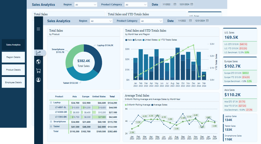
From Sketch to Screen: Bringing your Power BI report navigation to life for an enhanced user experience.
In the world of data visualization, we are constantly seeking ways to convey information and captivate our audience. Our goal is to enhance the aesthetic appeal of our Power BI reports, making them more than just vehicles for data—they become compelling narratives. By leveraging Figma, we aim to infuse our reports with design elements that elevate the overall user experience, transforming complex data into interactive stories that engage and enlighten.
A cornerstone of impactful multi-page reports is effective navigation. Well-designed navigation is a beacon that guides our users through the sea of data, ensuring they can uncover the insights they seek without feeling overwhelmed or lost. This post serves as a guide on how we can use Figma to enhance our Power BI report navigation beyond the use of just Power BI shapes, buttons, and bookmarks to create interactive report navigation that boosts the user experience of our reports.
In this guide, we will explore how to go beyond using the page navigator button option in Power BI and craft a report navigation that is intuitive, interactive, and elevates the visual aspects of our report. We will dive into how we can use Figma’s design capabilities combined with the interactive features of Power BI to create such an experience.
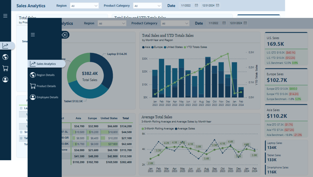
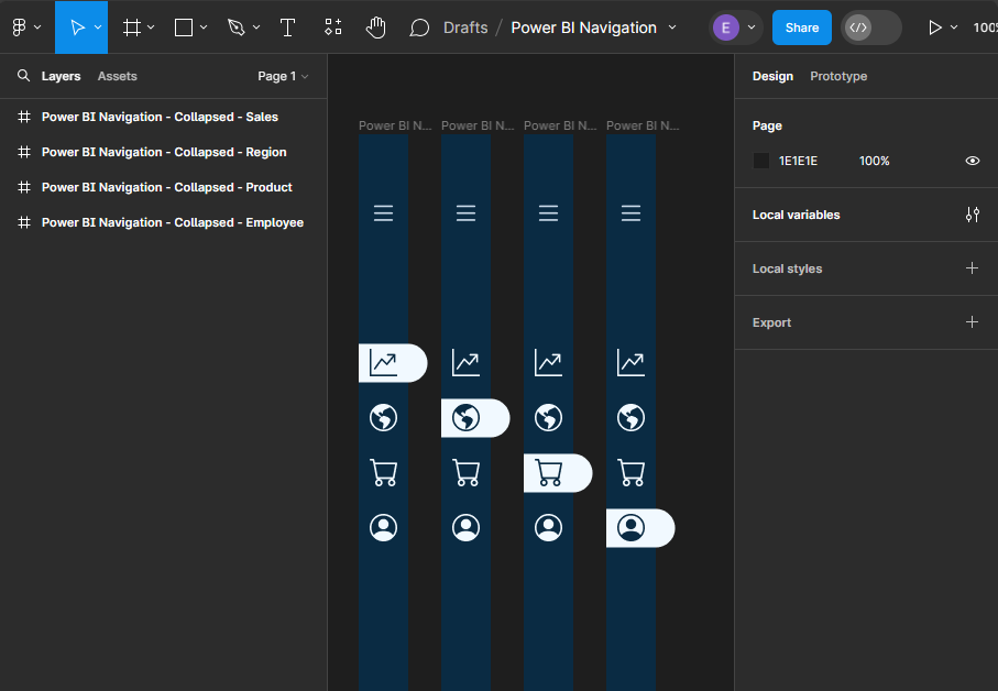
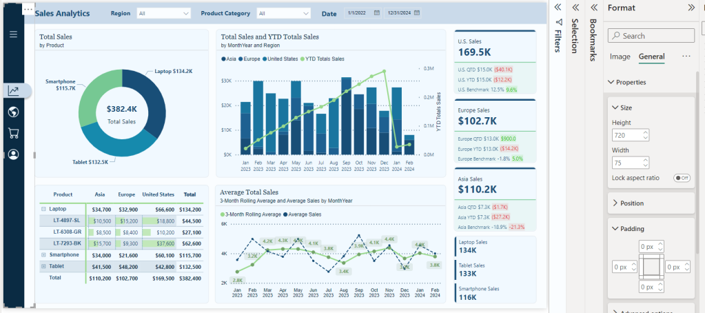
The navigation we will create is a vertical and minimalistic navigation displaying visual icons for each of the report’s pages. This allows our users to focus on the data and the report visuals and not be distracted by the navigation. However, when our users require details on the navigation options, we will provide an interactive experience to expand and collapse the menu.
Keep reading to get all the details on leveraging the design functionality offered by Figma and the interactive elements, including buttons and bookmarks in Power BI. By the end, we will have all we need to craft report navigation elements that captivate and guide our audience, making every report an insightful and enjoyable experience.
Get Started with Power BI Templates: For those interested in crafting a similar navigation experience using Power BI built-in tools, visit the follow-up post below. Plus, get started immediately with downloadable Power BI templates!
Also, check out the latest guide on using Power BI’s page navigator for a streamlined, engaging, and easy-to-maintain navigational experience.
Diving Into Figma: Designing Our Navigation
Starting the journey of enhancing our Power BI reports with Figma begins with understanding why Figma is a powerful design tool. The beauty of Figma lies in its simplicity and power. It is a web-based tool that allows designers to create fluid and dynamic UI elements without a steep learning curve associated with some other design software. Another great aspect of Figma is the community that provides thousands of free and paid templates, plugins, and UI kits to get our design kickstarted.
To get started with Figma, we will need to create an account. Figma offers various account options, including a free version. The free version provides access to the most important aspects of Figma but limits the number of files we can collaborate on with others. Here is a helpful guide on getting started.
Welcome to Figma
Welcome to Figma. Start your learning journey with beginner-friendly resources that will have you creating in no time.
For our Power BI reports, using Figma means designing elements that are aesthetic and functional. Reducing the number of shapes and design elements required in our Power BI reports aids in performance.
Crafting the Report Navigation
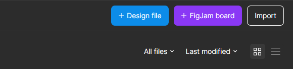
Once logged into Figma, we will start by selecting Drafts from the left side menu, then Design File in the upper right to open a new design file in Figma.
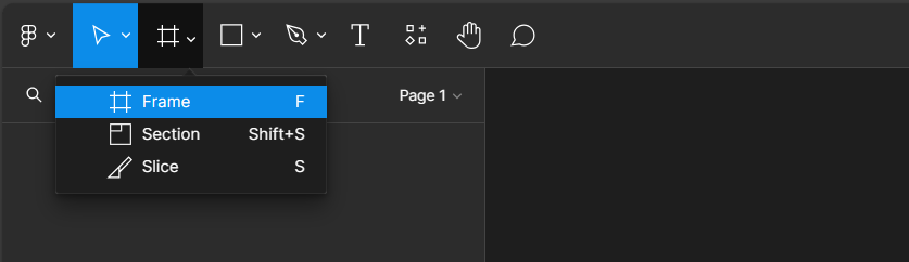
To get started with our new design we will add a frame to our design file and define the shape and size of our design.
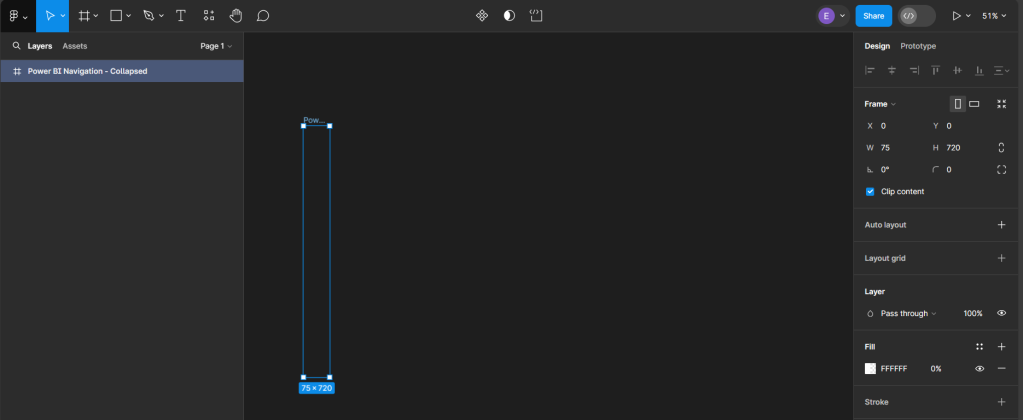
After selecting Frame, a properties panel will open to set the size of the Frame. For a standard Power BI report, the canvas size is typically 1280 x 720. We can use the pre-established size option for TV (under Desktop). We then rename the Frame by double-clicking on the Frame name in the Layers Panel and entering the new name, here we will use Power BI Navigation Collapsed. Then modify the width, since the navigation won’t occupy the entire report, to 75, and set the fill to transparent. This will act as the background or a container for our navigation when collapsed.
Creating Local Variables and Base Elements
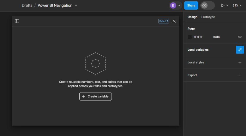
Before getting started adding elements to our navigation we will create local variables to store the theme colors of our navigation. On the Design pane, locate local variables and then select open variables.
Select Create variable and then Color to get started. For the navigation, we will create two color variables, one corresponding to the background element color and the other the first-level element color of our Power BI theme. If we are using Figma to design wireframes or mock-ups of our Power BI report, we can easily expand the number of variables to include all the colors used within the Power BI theme.
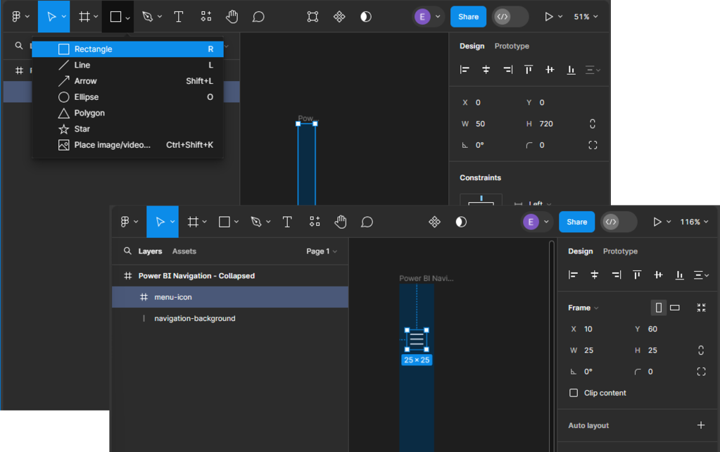
We start building our navigation by adding the base elements. This design includes the dark blue rectangle that will contain our navigation icons and the menu icon that, when clicked, will expand the navigation menu. Under the Shape tools menu select rectangle to add it to our Power BI Navigation - Collapsed frame, then set the width to 45.
Next, we will add the menu icon that will act as a button to expand and collapse the navigation menu. For this navigation, we will use a list or hamburger menu icon with a height and width of 25 that is centered and set towards the top within our navigation background. Then, set the color of the icon to our background-element variable. When searching for icons that fit the report’s styling, the Figma community has a wide range of options to offer.
Adding Page Navigation Icons
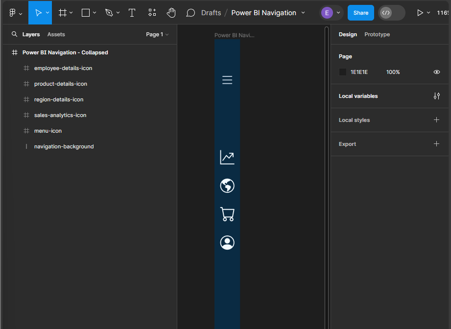
Once our base elements are set, we can move on to adding our page icons that will act as the page navigation buttons when the menu is collapsed. In the final report, we will add this navigation menu to contain four pages, so we will add an icon for each page. All icons will be the same size as the menu icon (height and width set to 25), centered horizontally in the navigation background, positioned vertically towards the top, and their color set to our background-element color.
This will serve as our base or template navigation menu for all pages. Next, we will copy this for each page in our report and modify it to indicate the current page.
To do this, we first add a line (under the Shape tools) with a width of 45, a stroke color of our background element, a stroke size of 35, and a round end point. Then, position it in the layers pane directly above the navigation so that it appears under the page icons. Once created, align it horizontally with the navigation background, and vertically centered under the current page icon. Update the color of the icon to the first-level-element variable, and then add a drop shadow. Repeat this process for each page icon, creating a navigation menu that can be added to each page of our report.
Creating the Expanded Menu
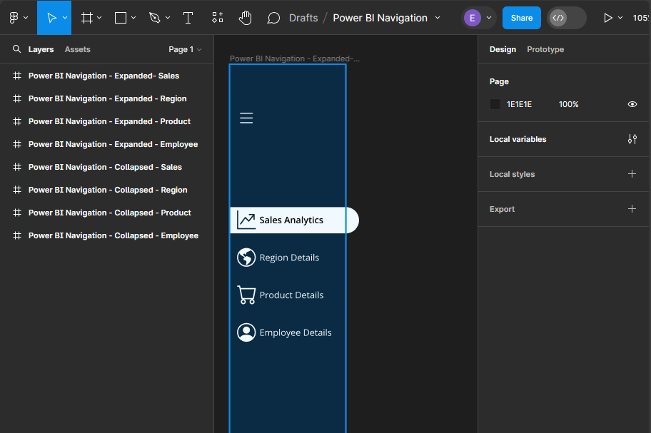
Now that we have completed the collapsed menu design elements, we will use these as the base to create the expanded menu. Creating the expanded menu starts by duplicating each of the collapsed menus. Once duplicated, we will rename each of the Power BI Navigation Frames to replace Collapsed with Expanded and then carry out a few steps for each.
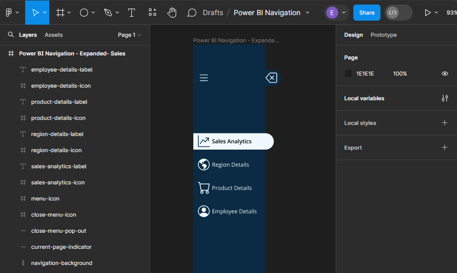
First, we increase the width of the Frame from 75 to 190, the width of the navigation-background rectangle, and the current-page indicator from 45 to 155.
Next, add new Text components for each page icon in the menu. The font color for each text component will match the icon’s color, and the font weight for the selected page text will be set to semi-bold.
In addition to being able to use the menu icon to toggle the navigation between collapsed and expanded, we will also add a specific collapse menu icon to the expanded menu. We first add a new line element to the expanded menu frame, with a width of 15, stroke size 35, and stroke color first-level-element. We position this on the right side of our navigation background and align it vertically centered with the menu icon. Then add a close icon with the same dimensions as all of our other icons and position it centered on this new line component.
By following these steps, we have taken the first step towards creating a visually appealing, dynamic, and interactive navigation element that will make our Power BI reports more engaging and user-friendly.
Exporting Figma Designs and Importing in Power BI
Once our navigation element is finished in Figma, the next step is bringing it to life within our Power BI Report. This involves exporting the designs from Figma and importing them into Power BI.
Preparing Our Figma Design for Export
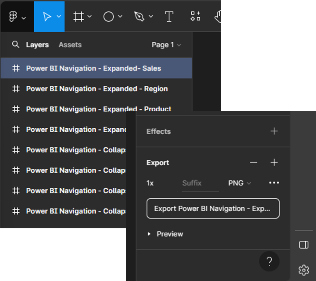
Before exporting our design, it is always a good idea to double-check the size of the different components to ensure they are exactly what we want, and so they integrate with our Power BI report seamlessly. Figma allows us to export our designs in various formats, but for Power BI, PNG or SVG files are a common choice.
To export our designs, select the Frame from the layers pane (e.g., Power BI Navigation—Expanded—Sales), and then locate export at the bottom of the design pane on the right. Select the desired output file type, then select Export.
Importing and Aligning Figma Designs within Power BI
Once our designs are exported, importing them into Power BI is straightforward. We can add images through the Insert menu, selecting Image and navigating to our exported design files.
Once imported, we adjust a few property settings on the image so it integrates with our report, creating a cohesive look and feel. First, select the image, and in the Format pane under General > Properties, we turn off the Lock aspect ratio option and then set the height to 720 and width to the width of the Figma frame (e.g., 75). Then we set the padding on all sides to zero. This ensures that our navigation is the same height as our report and appears properly.
Repeat the above process for the expanded navigation design.
Bringing Our Navigation to Life with Power BI Interactivity
When we merge our design elements with the functionality of interactivity of Power BI, we elevate our Power BI reports into dynamic, user-centric journeys through the data. This fusion is achieved through the strategic use of Power BI’s buttons and bookmarks, paired with the aesthetic finesse of our Figma-designed navigation.
Understanding the Role of Buttons and Bookmarks
Buttons in Power BI serve as the interactive element that users engage with, leading to actions such as page navigation, data filtering, or launching external links. The key to leveraging buttons effectively is to design them in a way that they are intuitive and aligned with the overall design of our report.
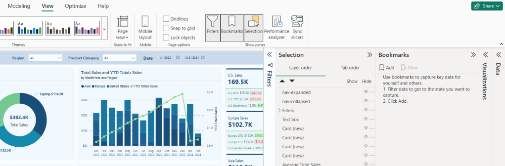
Bookmarks capture and recall specific states of a report, and most importantly for our navigation, this includes the visibility of objects. To create a bookmark first go to the View menu and select bookmarks to show the Bookmarks pane. Then we set our report how we want it to appear, then click Add, or if the bookmark already exists, we can right-click and select Update.
Step-by-Step Guide
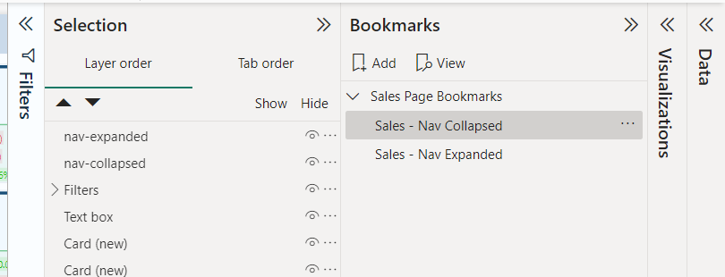
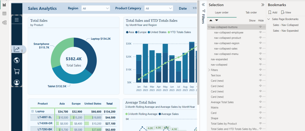
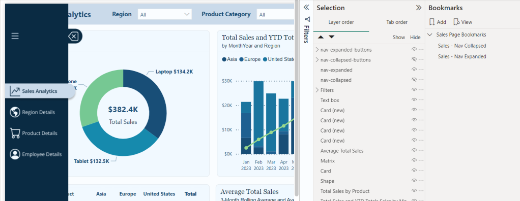
First from the View menu we will turn on the Selection and Bookmarks pane to get our report objects and bookmarks set for our navigation. We will see the image object in our Selection pane, which will be the two navigation images we previously imported. Rename these to give descriptive names, so we can tell them apart. For example nav-collapsed and nav-expanded.
We will add two bookmarks to this page of the report, one corresponding to the collapsed navigation and one for the expanded navigation. To keep our bookmarks organized, we will give them a descriptive name (- Nav Collapsed and -Nav Expanded) and if needed we can use groups to further organize them.
Now we will add buttons that overlay our navigation design element to add interactivity for our users. We will a blank button to our report with a width of 45 and a height of 35.
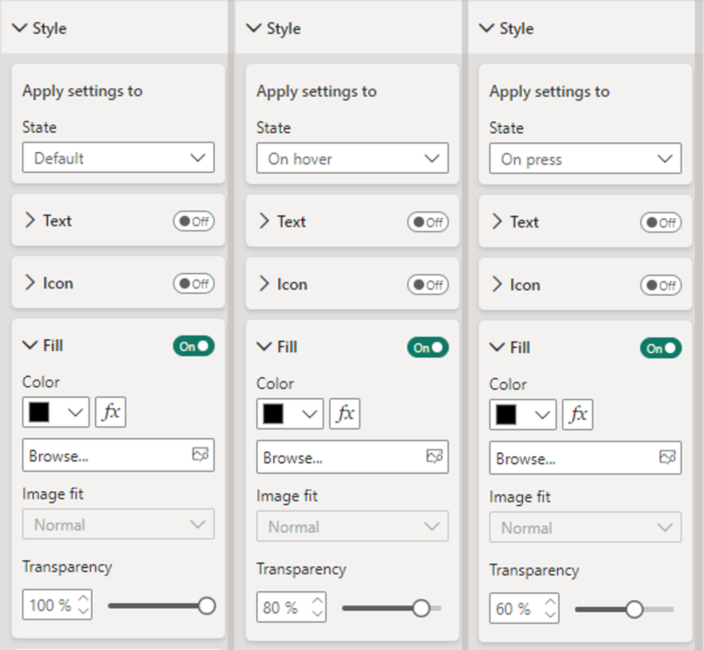
Then on the Format pane under Style, locate the Fill option for the button toggle it on, and set the following for the Default, On Hover, and On Press states.
Default: Fill: Black, Transparency: 100%
On Hover: Fill: Black, Transparency: 80%
On Press: Fill: Blank, Transparency: 60%
Duplicate this button for each page icon and position the buttons so that they overly each icon in the navigation menu. In the Selection pane double-click each button to rename the object providing it a description name (e.g. nav-collapsed-menu). Then select all and group them, providing the group a name as well (e.g. nav-collapsed-buttons).
Now that our buttons are created, styled, and positioned, we will set the specific actions required by each.
Navigation menu icon
Action
Type: Bookmark
Bookmark: Sales – Nav Expanded
Tooltip text: Expand Navigation Menu
The current page icon button
Action
Type: Page navigation
Destination: None
Tooltip text: Sales Analytics
Style
Fill: Toggle off (this will remove the darkening effect when hovered over since this page is active)
All other page icon buttons
Action
Type: Page navigation
Destination: Select the appropriate page for the icon
Tooltip text: Name of the destination page
Next, we copy and paste the nav-collapsed-buttons group to duplicate the buttons so we can modify them for our expanded navigation menu. After pasting the nav-collapsed-buttons group ensure to set the position to the same position as the initial grouping.
Rename this group with a descriptive name such as nav-expanded-buttons.
Additionally, rename all the buttons objects within the group to keep all our objects well organized and clearly named (e.g. nav-expanded-menu).
Adjust the visibility of our object so that the nav-collapsed-buttons group and nav-collapsed image are not visible, and their expanded counterparts are visible.
Set the width for all the page navigation buttons to 155. This will match our navigation background, which we created in Figma. No other properties should have to be set for these buttons.
Update the action of the nav-expanded-menu button and select the Sales - Nav Collapsed bookmark we created previously.
Copy and paste this button, then rename the new button as nav-expanded-close.
Resize and position this button over the close icon in our expanded navigation.
In the Selection pane drag and drop this button into the nav-expanded-buttons grouping.
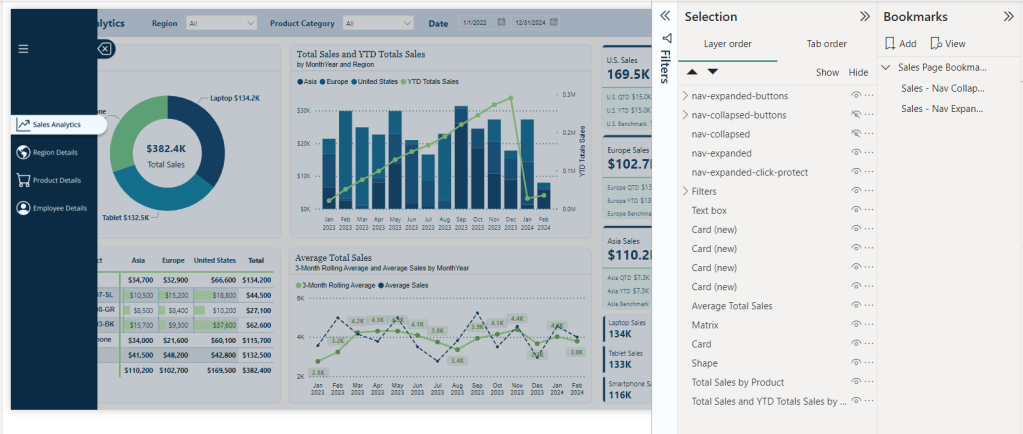
When the navigation is expanded, we want to prevent interaction with report visuals. To do this, we will add a new blank button to the report and size it to cover the entire report canvas.
In the Selection pane, place this button directly following the navigation images so it is below nav-expanded.
In the Format pane for the new button, under the General tab turn on the background and set the color to black with 80% transparency.
Turn on the action for this button, set it to a Bookmark type, and set the bookmark to our Sales—Nav Collapsed bookmark. This will ensure that if a user selects outside of the navigation options when the navigation is expanded, they are returned to the collapsed navigation state, where they can interact with the report visuals.
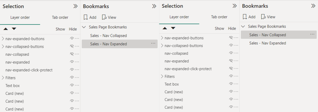
Lastly, we will set our bookmarks, so the correct navigation objects are shown for the expanded and collapsed bookmarks.
Right-click each bookmark and uncheck the Data option, so this bookmark will not maintain the current data state. When a user expands or collapses the menu or moves to a different page, we do not want to impact any selected slicers or filters they have selected.
Ensure the nav-collapsed-buttons grouping and nav-collapsed images are hidden while their expanded counterparts are visible. Then right-click the expanded bookmark and select update.
Select the collapsed bookmark, unhide the collapsed objects, and hide the expanded objects. Right-click the collapsed bookmark and select update.
Now that we have created all the interactivity for our navigation in Power BI for our Sales Analytics page, we can easily copy and move these objects (e.g., the button groupings) to each page in our report. Then, on each page, we will import the 2 Figma navigation designs specific to that page and then size and align them. After this we can add two new bookmarks for that page to store the collapsed and expanded state, using the same process we used in step #9. Finally, update the current page button to toggle off the styling fill and toggle on styling fill for the sales icon buttons (See step #4).
By blending Figma’s design capabilities with Power BI’s interactive features, we can create a navigation experience that elevates the appearance of our report and feels intuitive and engaging. This approach ensures our reports are not just viewed but interacted with, providing deep insights and a more enjoyable user experience.
Bringing It All Together: A Complete Navigation Experience
After creating our navigation visual elements in Figma and integrating them with the interactive powers of Power BI buttons and bookmarks, it’s time to bring it all together and see it in action.
Testing and Refining the Navigation
The key to a successful navigation experience for our users lies in its usability. It is important to conduct user testing sessions to gather feedback on the intuitiveness of the navigation. During these sessions, we can note areas where users hesitate or get lost. Then, using this feedback, we can further refine our navigation, making adjustments to ensure users can effortlessly find the information they need within our reports.
User Experience (UX) Tips for Power BI Reports
Well-designed navigation is just one piece of the UX puzzle. To further enhance our Power BI reports, we should also consider the following.
Clarity: ensure our reports are clear and easy to understand at a glance. We should use consistent labeling and avoid cluttering a page with too much information.
Consistency: apply the same navigation layout and style throughout our reports, and perhaps even across different reports. This consistency helps users learn how to navigate our reports more quickly.
Feedback: Provide visual and textual feedback when users interact with our report elements. For example, we could set the on hover and on pressed options for our buttons or use tooltips to explain what a button does.
Elevating Power BI Reports
By embracing the fusion of Figma’s design capabilities, UX tips, and Power BI’s interaction and analytical power, we can unlock new potential in our reports and user engagement. This journey from design to functionality has enhanced the aesthetic appeal, usability, and functionality of our report. Remember the goal of our reports is to tell the data’s story in an insightful and engaging way. Let’s continue to explore, iterate, and enhance our reports as we work towards achieving this goal while crafting reports that are beyond just tools for analysis but experiences that inform, engage, and fuel data-driven decisions.
If you found this step-by-step guide useful, check out the quick start on creating interactive navigation solely using Power BI’s built-in tools. It provides details on where and how to get downloadable templates to begin implementing this navigational framework for 2-, 3-, 4-, and 5-page reports!
Also, check out the latest guide on using Power BI’s page navigator for a streamlined, engaging, and easy-to-maintain navigational experience.
Thank you for reading! Stay curious, and until next time, happy learning.
And, remember, as Albert Einstein once said, “Anyone who has never made a mistake has never tried anything new.” So, don’t be afraid of making mistakes, practice makes perfect. Continuously experiment, explore, and challenge yourself with real-world scenarios.
If this sparked your curiosity, keep that spark alive and check back frequently. Better yet, be sure not to miss a post by subscribing! With each new post comes an opportunity to learn something new.
Dive into the details of blending design and data with custom Power BI themes.
At the intersection of design and data, crafting Power BI themes emerges as a crucial skill for effective and impactful reports that provide a clear and consistent experience. Through thoughtful design choices in color, font, and layout, we can elevate our report development strategy.
Let’s dive into the details of Power BI theme creation and unlock the potential to make our reports informative, impactful, and remembered. Keep reading to explore the blend of design and data, where every detail in our report is under our control.
Throughout this post we will be creating a Power BI theme file and a Power BI report to test our theme, both the file and report are available at the end of the post. Here is what we will explore.
Introduction to Power BI Themes
The Anatomy of a Power BI Theme
Step-by-Step Guide to Creating Our First Power BI Theme
Advanced Customization
Implementing Custom Themes in Power BI Reports
Creating a Template Report to Test Our Theme
Introduction to Power BI Themes
Have you ever stared at one of your Power BI reports and thought, “This could look so much better”? Well, you are not alone. Power BI themes and templates help us turn bland data visualizations into eye-catching reports that keep everyone engaged.
Themes in Power BI focus on the colors, fonts, and visual styles that give our reports a consistent look. Imagine having a signature style that runs through all your reports – that is what themes can help us do. They ensure that every chart, visual, or table aligns with our brand or a project’s aesthetic, making our report both informational and visually appealing.
No matter your Power BI role or skill level furthering our understanding of Power BI themes can significantly impact the quality of reports we create. So, let’s dive in and explore how we can create our own Power BI custom theme. Ready to transform our reports from meh to magnificent?
The Anatomy of a Power BI Theme
Let’s dive into some details and take a peek under the hood of a Power BI theme. If you have ever opened a JSON and immediately closed, again, you are not alone. But once you get the hang of it, it becomes more and more like reading a recipe of the visual aspects of our Power BI report.
Remember, as complex as the Power BI theme file may seem at its core it is structured text used to define properties like colors, fonts, and visual styles in a way Power BI can understand and apply across our reports.
Key Elements to Customize
Theme Colors: These colors are the heart of our theme. The theme colors determine the colors that represent data in our report visuals. When customizing our theme through Power BI Desktop or setting colors of a visual element we will see Color 1 – Color 8 listed, however the list of theme colors in our theme file can have as many colors as we require for automatically assigning colors in our visualizations.
In the theme color section is also where we find our sentiment and divergent colors as well. Sentiment colors are those used in visuals such as the KPI visual to indicate positive, negative, or neutral results. While the divergent colors are used in conditional formatting to show where a data point falls in a range and we define the colors for the maximum, middle, minimum, and null values.
Structural Colors: While theme colors focus on the data visualizations, structural colors deal with the non-data components of our report, such as the background, label colors, and axis gridline colors. These colors help to enhance the overall aesthetic of our reports.
Structural colors can be found in the Advanced subsection of the Name and Colors tab in the Customize theme dialog box.
We can find all the details on what each color class formats in the table at the link below.
Text Classes: Next, we can specify the font styles for different types of text within our report including defining the font size, color, and font family for things such as titles, headers, and labels.
Within our Power BI theme there are 4 primary classes out of a total of 12 that need to be set. Each of the four primary classes can be found under the Text section of the Customize theme dialog box. The 4 primary classes are the general class which covers most text within each of our visuals, the title class to format the main title and axis titles, the cards and KPIs class to format the callout values in card and KPIs visuals, and the tab headers class to format the tab headers in the key influencers visual.
The other text classes are secondary classes and derive their properties from the primary class they are associated with. For example, a secondary class may select a lighter shade of the font color, or a percentage larger or smaller font size based on the primary class properties.
For details on what each class formats view the table at the link below.
Visual Styles: To define and fine-tune the appearance of various visuals with detailed and granular control we can add or update the visual styles section of our Power BI theme JSON file.
The Power BI Customize theme dialog box offers a start into setting and modify visual styles. On the Visuals tab we will see options to set background, border, header and tooltip colors. It also provides options to set the colors or our report wallpaper and page background on the Page tab, and set the appearance of the filter pane on the Filter pane tab.
The visuals styles offer us the ability to get granular and ensure every visual matches the aesthetics of our report. However, with this comes a lot of details to work through, we will explore just some of the basics later in this post when customizing the Power BI Theme file.
By focusing on these components, the blueprint for crafting a Power BI theme begins to come together. Helping us create reports that resonate with our brand and elevates user experience by creating a clear and consistent Power BI appearance. As we get more comfortable with the nuances and details of what goes into a Power BI theme, we become better equipped to create a theme that brings our reports to life.
Step-by-Step Guide to Creating Our First Power BI Theme
Creating a custom Power BI theme might initially seem like an unattainable task and we may not even know where to start. The good news is that starting from scratch is not necessary. Let’s make the creation of our theme as smooth as possible by leveraging some handy tools and resources to get us started.
Starting Point: Customize Theme in Power BI Desktop
Starting to create our first Power BI theme does not mean we have to start from scratch. In fact, diving headfirst into a blank JSON file might not be the best way to start. Power BI offers a more user-friendly entry point through the Customize theme dialog box. As we saw in the previous section this user-friendly interface lets us adjust and set many of the core elements of our theme.
The beauty of starting here is not only its simplicity, but also the fact that Power BI allows us to save our adjustments as a JSON file. This file can serve as a great starting point for further customization, giving us a solid foundation to customize and build upon.
First, we will start by selecting a built-in theme that is close to what we want our end result to look like. If none of the built-in themes are close, don’t overlook the resources available right from the Theme dropdown menu in Power BI Desktop. Near the bottom we can find a link to the Theme gallery.
This is also where we find the Customize current theme option to get started crafting our Power BI Theme.
Selecting the Customize current theme will open the Customize theme dialog box where we are able to make adjustments to the current theme, and then we can save the theme as a JSON file for further customizations.
For those looking to tailor their theme further, there are numerous online theme generators that might be helpful. These can range from free basic tools to paid for advanced tools.
Crafting Our Theme

We will be creating a light color theme with the core theme colors ranging from blue to green, similar to the one applied to the report seen in the post below.
Theme Name and Colors
First, from the View ribbon we start by selecting the Theme drop down. From here we will start with the built-in Accessible Tidal theme. Once we select the built-in theme to apply it to the report, we navigate back to the Theme dropdown and select Customize current theme near the bottom.
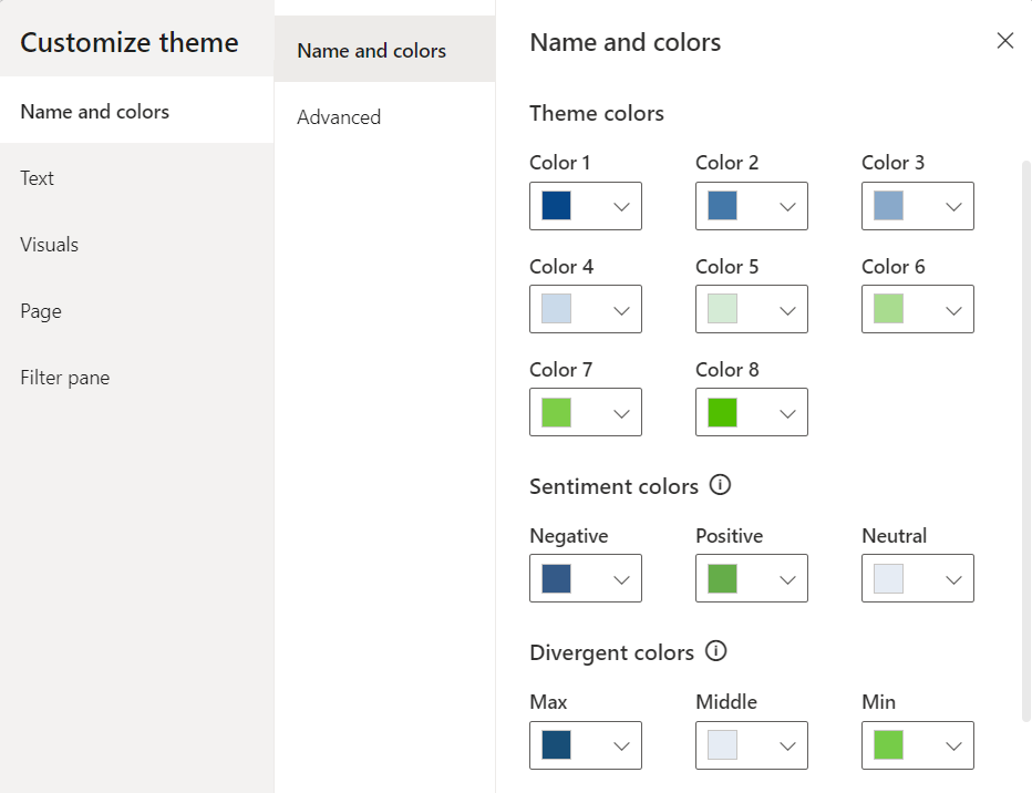
Then we start our customizations on the Name and color tab of the Customize theme dialog box. We set our theme colors, with colors 1-4 ranging from a dark blue to a light blue (#064789, #4478A9, #89A9CA, #CADAEA) and colors 5-8 ranging from a light green to dark green (#D5EBD6, #A9DC8F, #7DCE47, #51BF00). Next, we set the sentiment colors and divergent colors using blue and green as the end points and gray for the midpoint.
Then we hit apply and see how the selected theme colors are reflected in our report. On the left and the bar chart across the top we can see the 8 theme colors. The waterfall chart shows the sentiment colors with green representing an increase and the blue a decrease. Lastly, the divergent colors are utilized in the bottom right bar chart where the bar’s color is based on there percent difference from the average monthly sales values.
After setting the theme, sentiment, and divergent colors we can go back to the Customize theme dialog box and navigate to the Name and colors Advanced section to set our 1st-4th level element colors and our background element colors.
These color elements may not be as straightforward or as easy to identify compared to our core theme colors. Let’s explore some examples of each element.
Here are some of our report elements that are set by the first-, second-, third-, and fourth-level elements color of our customized theme.
And then here are some of our report elements that are set by the background and secondary background colors of our customized theme.
After we have set all of our theme and structural colors, we save our customizations and check in on our Power BI theme JSON file. To save our theme navigate to the Theme dropdown in Power BI and select Save current theme near the bottom. In this file we can see our theme colors listed in the dataColors array, followed by the color elements we set in the advanced section, and then our divergent and sentiment colors.
We can also see a remanent of the built-in theme we selected to start building our custom Power BI theme: tableAccent. We can see this color in our matrix visual, and it is used to set the grid border color.
Let’s use this to complete our first customization of our Power BI theme by editing the theme JSON file and loading the updated theme in Power BI Desktop. To do this, we first update the tableAccent property of the JSON file to the following and save the changes.
Then back in our Power BI report, within the Theme dropdown we select Browse for themes and select our updated Power BI theme JSON file. Power BI will validate our theme file, and once applied we see a dialog box informing us the file was successfully added. And just like that we updated our Power BI custom theme by editing the JSON file.
Now that our theme colors are set, let’s move onto setting our text classes.
Theme Text Classes
In the Customize Theme dialog box we will now shift our focus to the Text tab to set the font styles for various text elements. Within Power BI Desktop we can set the general text, title text, card and KPIs, and tab headers.
Let’s add some more elements to our previous report so we can explore and see more of our theme components in action. Here are some examples of what the different text classes format.
For the theme we are building here is how we will set our text classes:
General – Font family: Segoe UI, Font size: 10, Font color: a dark blue (#053567)
Title – Font family: Segoe UI Semibold, Font size: 12, Font color: a dark blue (#053567)
Cards and KPIs – Font family: Segoe UI, Font size: 26, Font color: our theme color #1 (#064789)
Tab headers – Font family: Segoe UI Semibold: Font size 12, Font color: a dark blue (#053567)
Here is the updated report with our text classes defined in our Power BI theme.
Now we can save the report theme to update the Power BI theme JSON file and check in on the new text classes sections that has been added to it. To save our theme navigate to the Theme dropdown in Power BI and select Save current theme near the bottom.
Let’s continue working through the Customize Theme dialog box and move to the Visuals tab. The Visuals tab allows us to customize the appearance of charts, graphs, and other data visualization components. On this tab we can set the background, border, header, and tooltip property of our visualizations.
Our visual background will be set to a light blue (#F6FAFE).
Then we will move to the next section to turn on and set our visual boarder color to the same dark blue color we used for our text classes (#053567) with a radius of 5.
Next, the header of our visualizations. We will use the same background color as we did in the Background section. For the border and icon color, we will set them to the same color we used in the Border section.
Lastly, we finish up with formatting our Tooltips by setting the label text color and value text color to the same dark blue we have been using for our text elements and the same light blue for the background that we used for the other Visual sections.
Then let’s hit apply and check our report page we are creating to see the different aspects of our theme.
We can also see these updates reflected in the addition of the "visualStyles" property to our Power BI theme file. Before we take a look at the details of our "visualStyles", lets first examine an example of the section.
The visualName and cardName sections are used to specify a visual and card name. Currently, the styleName is always an asterisk ("*").
The propertyName is a formatting option (e.g. color), and the propertyValue is the value used for that formatting option.
For the visualName and cardName we can use an asterisk in quotes ("*") when we want the specified setting to apply to all visuals that have the specific property. When we use "*" for both the visual and card name we can think of this as setting a global setting similar to how our text classes font family and font size is applied across all visuals.
Below is our updated Power BI JSON theme file where we can see the "*" used for the visual and card name, meaning these settings are applied to all our visuals that have the property.
To wrap up our starting point of our customized theme we will move onto the Page and Filter pane tabs of the Customize theme dialog box.
On the page tab we set the wallpaper color to a light blue gray (#F1F4F7) and the page background a slightly lighter shade (#F6FAFE).
On the Filter pane tab, we set the background color to the same color used for the page background, the font and icon color a dark blue similar to our other font and icon colors (#0A2B43), and the same for checkbox and apply color (#053567). The available color background color is set to the same color used for a visual background (#F1F9FF), and the font and icon is set to the same dark blue used in the Filter pane section (#0A2B43). The applied filter card background is set to a gray color (#E5E9ED), and the font and icon color set to the same dark blue (#0A2B43) used in the other filter pane sections.
This resulting theme servers as a great starting point for further customizations and we can edit it directly to add more detailed and granular control of our theme. We will begin to make these granular updates in the next section.
By using the Customize theme dialog box, we streamline the initial steps of theme creation, making it an accessible and less intimidating process. This hands-on approach not only simplifies the creation of our custom theme but also provides a visual and interactive way to see our theme come to life in real-time.
With this foundation set, we are now ready to explore the full potential of our theme by venturing into editing our theme JSON file for more advanced customizations.
Advanced Customization
Once we get the hang of creating, updating, and applying custom themes in Power BI, we might encounter scenarios that require a deeper dive into customizations.
Customize Report Theme JSON File
When we are editing our theme JSON file, we can add the properties we want to add additional formatting to. That is, in our theme file we only have to specify the formatting options that we want to change, any setting that is not specified will revert to the default settings of our theme.
After making our edits we can import our file and Power BI will validate that it can successfully be applied, if there are properties that cannot be validated Power BI will show us a message that the theme file is not valid. The schema used to check our file is updated and available to download here. This report schema can also help us identify properties that we have available to style within our theme file.
To start the journey into advanced customization through editing the JSON file we will focus on our table and matrix visuals, slicers, and the new card visual.
Here is what our default table and matrix visuals look like when our theme is applied.
We will start by updating the formatting of our table visual by adding the tableEx property to our theme file. We will then apply a dark blue fill to our column headers with a light-colored font, set the primary and secondary background colors, and set the totals formatting to match the headers.
Here is the JSON element added to the visualStyles section of our theme file.
Now if we look at background (backcolor) of our columnHeaders we can see that it is hard set to the color value #053567. And depending on our requirements this may work, but it might be preferred (or beneficial) to define this color value in a more dynamic way. The color property can also be defined using expr and reference a theme color (e.g. theme colors 1-8).
Let’s see how this works by updating the backcolor property using a color 25% darker than Color #1 we defined previously in our theme.
The benefit of defining the header background color this way is if we change our primary theme colors our table column header background will update automatically to a darker shade of our Color #1 in our theme. We can do the same with the font color.
Next, we turn our focus to the matrix visual by adding the pivotTable section to our theme file and we will style it similar to our table visual. Here is the pivotTable section added to our theme file.
And then the final results for our table and matrix visual.
Next, we will make some updates to our default slicers. By default, our slicer inherits the same background color and outline as all are other visuals. Since we have the slicers sectioned off in a header we are going to format them slightly differently. We will remove the background and visual boarder for these elements.
Here are our initial slicers for product, region, and year/quarter.
We can add a slicer property to our theme file and then specify we want to set the background transparency to 100% and set the show property of the border to false.
After updating our theme file with these updates and applying them to our report we can see the updated formatting of our slicers.
Now we will shift our focus to the Card (new) visual, specifically we will format the reference label portion of this visualization. By default, the background and divider are gray, we will bring these colors more in line with our theme by setting the background color to a lighter green and the divider to Color #8 of our theme colors. To format this visual we add a cardVisual section to our theme file with the referenceLabel style name specify the backgroundColor and divider properties that we want to format. Here is the cardVisual section added to our theme file.
And then here are the changes to the visualization.
Formatting our table, matrix, slicer, and card (new) visualizations is just the start of the options available to us once we are familiar with customizing our theme file. Piece by piece we can add to this file to continue to fine-tune our theme.
Checkout the final theme file and report at the end to see all the customization made including formatting our visual titles, subtitles, dividers and much more.
Implementing Custom Themes in Power BI Reports
After pouring over the details and meticulously updating our custom theme for our Power BI reports, it is time to bring it to life. Implementing our custom theme helps transform our report from the standard look to something uniquely ours.
How to Apply Our Custom Theme to a Report
First, we must have our report open in Power BI Desktop. Then we can go the View tab, and we will find the Theme dropdown menu. In the Theme menu we scroll to the bottom and select Browse for themes. In the file explorer navigate to our custom theme JSON file and select it. Once selected, Power BI automatically applies the theme to the entire report, giving it an instant new look based on the colors, fonts, and styles we have defined.
Adjusting visuals individually: while our theme sets a global standard for our report, we still have the option to customize individual visuals if it is required. This can be done using the Format pane to make the required adjustments that override the theme setting for that specific element.
Experiment with Colors and Styles: if something does not look quite right, or we find ourselves making the same adjustments to individual visuals over and over, we cannot be afraid to go back to the drawing board. Adjusting our theme file and reapplying it to our report is a quick process that can lead to significant improvements.
Gather Feedback: once our theme is implemented, gather feedback from end-users. They might offer valuable insights into how our theme performs in real-world scenarios and suggest further improvement.
Implementing a custom theme in Power BI improves the aesthetics of our reports while also enhancing the way information is presented and consumed. With our custom theme applied, our reports will not only align with our visual identity but also offer a more engaging and coherent experience for our users.
Creating a Template Report to Test Our Theme
After mastering custom themes in Power BI, taking the next step to create a template report can significantly streamline our workflow. A template report serves as a sandbox for testing our theme and any updates we make.
Having a template report will enable us to see how our theme performs across a variety of visuals and report elements before rolling it out to our actual reports.
How to Create a Template Report: A Step-by-Step Approach
Selecting Visuals and Layouts: We start by creating a new report in Power BI Desktop. In the report include a wide range of visuals that are commonly used. This diversity ensures that our theme is thoroughly tested across different data representations.
Incorporating Various Data Visualization Types for Comprehensive Testing: To truly test our theme, beyond the commonly used visuals, also mix in and experiment with other visuals that Power BI offers. Apply conditional formatting where applicable to see how our theme handles dynamically changing visuals elements.
Tips for Efficient Template Report Design:
Use sample data that reflects the complexity and diversity of real datasets. This ensures that our theme is tested in conditions that closely mimic actual reporting scenarios.
Label our visuals clearly to identify them easily when reviewing how the theme applies to different elements. This can help us spot inconsistencies or areas for improvement in our theme.
Iterate and refine. As we apply our theme to the template report, we might find areas where adjustments are necessary. Use this as an opportunity to refine our theme before deploying it widely.
Creating a template report is an invaluable step in theme development. It offers a controlled environment to experiment with design choices and see firsthand how they translate into actual reports. By taking the time to craft and utilize a template report, we ensure that our custom theme meets our aesthetic expectations while enhancing the readability and effectiveness of our Power BI reports.
Leveraging Power BI Themes and Templates
Let’s build a report to view and test our themes. The first page we add is meant to mimic the spacing and visualization balance of a report page, while also including elements that utilize the theme colors, sentiment colors, and divergent colors.
On this page we can see the main colors of our theme on the Product and Region bar charts, the sentiment colors on the waterfall chart, and the divergent colors on the Totals Sales by MonthYear bar chart on the bottom right. Additionally, we can see the detailed updates we made to the matrix visual and slicers.
The other pages of the report focus on displaying the theme colors and their variations, and specific elements or visualization groups available to us in Power BI. Take a look at each page in the gallery below.
Eager to dive into the details?
The final report and JSON theme created throughout this post can found on my GitHub at the link below.
Wrapping Up
As we begin to learn and understand more about Power BI themes and how to efficiently leverage them, we start to unlock a new level of data visualization and report development.
We have navigated the intricacies of creating a custom theme, from understanding the fundamental components to implementing advanced customization techniques. Along the way, we also discovered the value of a template report in testing and refining our Power BI themes. Having a go to report to test our theme development helps us ensuring they not only meet our aesthetic standards but also enhance the readability and accessibility of our reports.
As we complete this exploration of Power BI themes, it becomes clear that the journey does not end here, in fact it is only just the starting point. The field of data visualization is dynamic, with new trends, tools, and best practices emerging regularly. Meaning, the ongoing refinement of our Power BI themes is not just a static task to mark as complete, it is an opportunity to continuously enhance the effectiveness and impact of our Power BI reports.
Armed with our new understanding of Power BI themes, it is time to go explore more, experiment with updates, and continue to transform our reports into even more powerful tools.
Thank you for reading! Stay curious, and until next time, happy learning.
And, remember, as Albert Einstein once said, “Anyone who has never made a mistake has never tried anything new.” So, don’t be afraid of making mistakes, practice makes perfect. Continuously experiment, explore, and challenge yourself with real-world scenarios.
If this sparked your curiosity, keep that spark alive and check back frequently. Better yet, be sure not to miss a post by subscribing! With each new post comes an opportunity to learn something new.
Ever wondered how to tackle Power BI data challenges? Find out how I transformed this challenge into an opportunity to learn and then into an achievement.
Over the last two years I have ended each of my posts with two main messages, (1) stay curious and happy learning, and (2) continuously experiment, explore and challenge yourself. However, at times it can be hard to identify open ended opportunities to fulfill these.
One opportunity available is participating in various data challenges. I recently participated in and was a top 5 finalist in the FP20 Analytics ZoomCharts Challenge 15. This data challenge was a HR data analysis project with a provided dataset to explore and a chance to expand your report development skills.
What I enjoyed about the challenge is along with the dataset, it provided a series of questions to help guide the analysis and provide direction and a focus for the report.
Here is the resulting report submitted to the challenge and discussed in this post. View, interact, and get the PBIX file at the link below.
About the Challenge
The FP20 Analytics challenge was in collaboration with ZoomCharts and provided an opportunity to explore custom Power BI ZoomCharts drill down visuals.
The requirements included developing a Power BI report with a default canvas size, a maximum of 2 pages, and include at least two ZoomCharts Drill Down Visuals.
The goal of the challenge was to identify trends within the dataset and develop a report that provides viewers the answers to the following questions.
How diverse is the workforce in terms of gender, ethnicity, and age?
Is there a correlation between pay levels, departments, and job titles?
How about the geographic distribution of the workforce?
What is the employee retention rate trend yearly?
What is the employee retention rate in terms of gender, ethnicity, and age?
Which business unit had the highest and lowest employee retention rate?
Which business unit and department paid the most and least bonuses annually?
What is the annual historical bonus trend? Can we show new hires some statistics?
How about the pay equity based on gender, ethnicity, and age?
What is the employee turnover rate (e.g., monthly, quarterly, annually) since 2017?
There are countless ways to develop a Power BI report to address these requirements. You can see all the FP20 Analytics ZoomCharts Challenge 15 report submissions here.
This post will provide an overview and some insight into my approach and the resulting report.
Understanding the Data
With any analysis project, before diving into creating the report, I started by exploring and getting an understanding of the underlying data. The challenge provided a single table dataset, so I loaded the data into Power BI to use the Power Query editor’s column distribution, column profile, and column quality to help get an understanding of the data.
Using these tools, I was able to identify missing values, data errors, data types, and get a better sense of the distribution of the data. This initial familiarity will help inform the analysis and help identify what data could be used to answer the requirement questions, identify data gaps, and help ask the right questions to create an effective report.
The dataset contained 16 columns and provided the following data on each employee.
Employee/Organizational characteristics
Employee ID, full name, job title, department, business unit, hire date, exit date
Demographic information
Salary information
Annual salary and bonus percentage
Location information
City, country, latitude, longitude
The dataset was already clean. No columns contained any errors that had to be addressed, and the only column that had empty/null values was exit date, which is expected. One thing I noted at this stage is that the Employee ID column did not provide a unique identifier for an employee.
Additionally, I used a temporary page in the Power BI report containing basic charts to visualize distributions and experiment with different types of visuals to see which ones best represent the data and help reach the report objectives. Another driver of using this approach was start experimenting with and understanding the different ZoomCharts and their customizations.
Identifying Key Data Attributes
Once I had a basic understanding of the dataset, it is always tempting to jump right into data manipulation and visualization. However, I find it helpful at this stage to pause and review the questions the report should answer.
During this review I was able to further define these goals, with my new understanding of the data, which guided the selection of relevant data within the dataset.
I then broke the questions down into 3 main areas of focus and began to think about what data attributes within the dataset can be used, and possibility more importantly, think about what is missing or how I can enrich the dataset to create a more effective report.
Workforce Diversity (Question #1 and #3)
To analyze the workforce diversity, the dataset provided a set of demographic information fields that aligned with these questions.
The next set of questions I focused on revolved around the salary and bonus structure of the organization. I identified I could use the demographic fields along with the salary information to provide insights.
Employee Retention & Turnover (Questions #4, #5, #6, and #10)
The dataset did not directly include the retention and turnover rates and required enriching the dataset to calculate these values. To do this I used the hire date and exit date. Once calculated I am able to add an organization context to the analysis by using the business unit, department, and job title attributes.
Dataset Enrichment
After identifying key data attributes that can be used to answer the objectives of the report, it becomes clear that there are opportunities for enriching the dataset to aid in making a more effective visualization (e.g. age bins) and address data gaps or require calculations (e.g. employee retention and turnover).
For this report I achieved this through the use of both calculated columns and measures.
Creating Calculated Columns
Calculated columns are a great tool to add new data based on existing information in the dataset. For this report I created 7 calculated columns which were required because I wanted to use the calculated result in axes of report visuals or as a filter condition in a DAX query.
Age Bin: categorized the employee’s age based on their age decade (20s, 30s, 40s, 50s, or 60s). Here I used a calculated column rather than the built-in data group option to provide more flexibility and control over the bins.
Tenure (Years): while exploring salary across departments and demographic categories, I also wanted to include context for how long the employee has been with the organization as this might influence their salary and/or bonus.
Total Compensation: the dataset provided annual salary and bonus percent. The bonus percent was helpful when examining this attribute specifically, however when analyzing the organization pay structure across groups, I found the overall page (salary + bonus) to be more insight and provide the entire picture of the employee’s compensation.
Employee Status: the dataset included current and past employees. To ease analysis and provide the users the ability to filter on the employee’s status I included a calculated column to label the employee as active or inactive.
Abbreviation: the report required providing insight broken down by business unit, country, and department all of which could have long names and clutter the report. For each of these columns I included a calculated column providing a 3-letter abbreviation to be used in the report visuals.
Defining Measures
In addition to calculated columns, the report included various calculated measures. These dynamic calculations are versatile and aid the interactive nature of the Power BI report.
For this report I categorized my measure into the following main categories.
Explicit Summaries: these measures are not strictly required. However, I prefer the use of explicit aggregation measures over implicit auto-aggregation measures on the visuals due to the increased flexibility and reusability.
Average Total Compensation
Average Bonus ($)
Average Bonus (%)
Highest Average Bonus % (Dept) Summary
Lowest Average Bonus % (Dept) Summary
Maximum Bonus %
Minimum Bonus %
Average Annual Salary
Maximum Annual Salary
Median Annual Salary
Minimum Annual Salary
Active Employee Count
Total count
Each ethnicity count
Male/Female count
Inactive Employee Count
Report Labels: these measures were used to add additional context and information to the user when interacting with drill down visuals. On the drill down visuals when a user selects a data category or data point the visual drills down and shows the next level of the data hierarchy. What is lost, is what top level category was selected, so these labels are used to provide that information.
Selected Age Bin
Selected Business Unit Retention
Selected Business Unit Turnover
Selected Dept Retention
Selected Dept Turnover
Retention & Turnover: 4 of the report objectives revolved around employee retention and turnover rates. The dataset only provided employee hire dates and exits which are used to calculate these values.
Cumulative Total Employee Count (used in retention rate)
Employee Separations (used in retention rate)
Employee Retention
Brazil Retention Rate
China Retention Rate
United Sates Retention Rate
Employee Turnover Rate
Brazil Turnover Rate
China Turnover Rate
United States Turnover Rate
Report Development
After understanding the dataset, identifying key data attributes, and enriching the dataset I moved onto the report development.
Report Framework
From the requirements I knew the report would be 2 pages. The first focused on Workforce Diversity and Salary & Bonus Structure. The second focused on Employee Retention & Turnover.
I started the report with a two-page template that included all the functionality of an expandable navigational element. For details on how I created this, and where to find downloadable templates see my post below.
This navigation is a compact vertical navigation that can be expanded to provide the user page titles and was highlighted as a strong point of the report in the Learn from the Best HR Reports: ZoomCharts TOP Picks.
Then I selected the icons used in the navigation and updated the report page titles on each page and within the expanded navigation.
Once the template was updated for the specifics of this report, I applied a custom theme to get the aesthetic just right. For more on creating custom themes and where to find downloadable themes, including the one used in this report (twilight-moorland-plum), see the following post.
After updating the navigation template and implementing the report theme, I was set with a solid foundation to begin adding report visuals.
Demographic & Compensation Analysis
The first page of the report focused on two main objectives, the demographic distribution of the workforce and an in-depth analysis of the organizational compensation structure.
Demographic Distribution
The first objective was to provide the user insights into the diversity of the workforce in terms of gender, ethnicity, and age. This was a perfect fit for the Drill Down Combo PRO (filter) by ZoomCharts visual. The visual displays the percentage of the workforce broken down by gender and displayed by employee age. Each age bin then can be drilled into to reveal additional insights into the age bins ethnicity make up.
In addition to the core visual, I included a card visual displaying the Selected Age Bin measure to provide context to the data when viewing an age bins ethnicity make up.
Geographic Distribution
The other component of this analysis was objective #3 focused on the geographic distribution of the workforce. In my submitted report this comprised of two elements the first and primary visual is the Drill Down Map PRO (Filter) by ZoomCharts visual. The second is a Drill Down Combo Bar PRO (Filter) by ZoomCharts visual.
The Map visual shows the ethnicity of the workforce as a percentage of the total workforce for each geographic location.
This visual in the report had noted limitation. Mainly the initial view of the map did not show all the data available. The inclusion of the country break provided an effective means to filter to a specific country however, it crowded the visual. Additionally, the colors in the report for the ethnicity groups of Asian and Black used the same colors used throughout the report for Male and Female which can be a source of confusion. See the Feedback and Improvements sections to see the updates to more effectively visual this data.
The first component of the compensation structure analysis was to examine the median total compensation (salary + bonus) by departments, business units and job title. The second was to provide insights into compensation equity among the demographic groups of age, ethnicity, and gender.
I used the Drill Down Combo PRO (Filter) visual to analyze the median total compensation for each organizational department broken down by gender. Each department can be drilled into to extract insights about the business unit and further drilled into each job title. I also included the average tenure in years of the employees within each category to better understand the compensation structure of the organization.
This report section contained another Drill Down Combo PRO (Filter) visual to provide insights on the median total compensation by ethnicity and gender. These two visuals when used in tandem and leveraging cross-filtering can provide a nearly complete picture of the compensation structure between departments and equity across demographic groups.
When the two Median Total Compensation visuals are used along with the demographic and geographic distributions visuals a full understanding and in-depth insights can be extracted. The user can interact and cross-filter all of these visuals to tailor the insights to meet their specific needs.
The second component of the compensation structure analysis was to provide an analysis of departmental bonuses and historical bonus trends.
To provide detailed insights into the bonus trends I utilized a set of box and whisker plots to display granular details and card visuals to provide high-level aggregations. I will note that box and whisker plots may not be suitable in every scenario. However, for an audience that is familiar and comfortable interpreting these plots they are a great tool and were well suited for this analysis.
Workforce Retention & Turnover
The second page of the report focused on the analysis of employee retention and turnover. For this report the retention rate was calculated as the percentage of employees that remained with the organization during a specific evaluation period (e.g. annually) and the turnover rate is the rate at which employees left the organization expressed as a percentage of the total number of employees.
For this analysis, I thought it was key to provide the user and quick and easy way to flip between these metrics depending on their specific requirement. I did this by implementing a button experience at the top of the report, so the user can easily find and reference what metric they are viewing.
Another key aspect to enhance the clarity of the report is the visuals remain the same regardless of the metric being viewed. This eases the transition between the different views of the data.
Across the top of the report page is a set of Drill Down Combo Bar PRO (Filter) visuals to analyze the selected metric by department and business unit on the left and age, gender, and ethnicity in the right-side grouping.
Each of these visuals also use the threshold visual property to display the average across all categories. This provides a clear visual indicator of how a specific category is performing compared to the overall average (e.g. retention for the R&D Business Unit is slightly worse (87%) than the organizational average of 92%).
All of these visuals can be used to cross-filter each other to get highly detailed and granular insights when required.
In addition to examining the retention and turnover rate among organizational and demographic groups there was an objective to provide insight to the temporal trends of these metrics. The Drill Down Timeline PRO (Filter) visual was perfect for this.
This visual provides a long-term view of the retention and turnover rate trend while providing the user an intuitive and interactive way to zoom into specific time periods of interest.
Additional Features
Outside to of the main objectives of the report outlined by the 10 specified questions there were additional insights, features, and functionalities built into the report to enhance usability and the user experience.
On the Demographic & Compensation Analysis page this included a summary statistics button to display a high-level overlay of demographic and salary summaries.
On both pages of the report there was also a clear slicer button to clear all selected slicer values. However, this clear slicer button did not reset the report to an initial state or reset data filters due to user interactions with the visuals. See the Feedback and Improvements section for details and the implemented fix.
Lastly, each page had a guided tutorial experience to inform new users about the report page and all the different features and functionalities the report and the visuals offered.
There are various other nuanced and detailed features of this reports and too much to all cover here. But please check out and interact with the report here:
Feedback and Improvements
My submitted report was discussed in the Learn from the Best HR Reports: ZoomCharts TOP Pick webinar which provided excellent feedback on areas to improve the report.
You can view the webinar discussion below.
The first improvement was to address the sizing of the map. Initially, when the report loads the map visual is too small to view all of the data it provides.
To address and correct this the Employee Count by country visual was removed. This visual provided helpful summary information and an effective way to filter the map by country, however, the benefits of displaying all the data on the map outweigh the benefits of this visual.
Also mentioned in the discussion of the map is the limitation in colors. Initially the ethnicity groups Black and Asian used the same colors used to visualized gender and a source of potential confusion.
To address this, I extended the color palette to include two additional colors to better distinguish these groups. These groupings are also visible on the Workforce Retention & Turnover page. These visuals were also updated to ensure consistency across the report.
The next area of feedback was around the clear slicer button. As shown in the webinar it only clears the selected slicer values and uses Power BI’s built-in Clear all slicers button.
The functionality of the clear filter button on both pages was updated to reset the report context to a base state with no filters applied to the page. The size of the button was also increased to make it easier to identify for the user.
Another point of feedback was regarding the navigation icon tooltips. I did not make an adjustment to the report to address this. As shown in the webinar if you hover over the active page icon there is not a visible tool tip. I left the report this way because the current page icon indicator on the navigational element and the report page has a title providing this information to the user.
However, on each page if you hover over an icon to a different page, there should be a tool tip that displays and addresses the main objective of this feedback. This functionality is correct on the Demographic & Compensation Analysis page but required correcting on the Workforce Retention & Turnover page to be consistent.
Lastly, there was feedback on the use of the Box and Whisker plot within the report. I agree the use of this visual is heavily dependent on the end user’s comfortability with interpreting these visuals and is not suitable in all cases. However, for this report I think they provide a helpful visualization of the bonus data and remained in the report.
Wrapping Up
Getting started with participating in these type of data challenges can be an intimidating task. With Power BI and report development there is always more to learn and areas to improve so there is not some static skill level or point to begin with these challenges. The best method to move forward is to just start and show yourself patience as you learn more and grow your skills.
For me, the main take aways from participating in this challenge and why I plan to participate in more moving forward are:
When learning a new skill repetition and continued use is essential, and with report development the more reports you create the better and more experienced you will be. This challenge provided an excellent opportunity to use a unique dataset to create a report from scratch.
Others are using the same data and creating the own report to share. Viewing these different reports to see how others solved the same data challenge can be extremely helpful in growing your skills and expanding the way you approached the challenge.
Participating in the ZoomCharts Challenge provided tailored feedback on the report submission. Providing helpful insight on how others viewed my report and highlighting areas for improvement.
Access to custom visuals. Through this challenge I was able to learn and work with ZoomCharts custom visuals. I really enjoyed learning these and adding that experience to my skillset. Find out more about these extremely useful visuals here.
Thank you for reading! Stay curious, and until next time, happy learning.
And, remember, as Albert Einstein once said, “Anyone who has never made a mistake has never tried anything new.” So, don’t be afraid of making mistakes, practice makes perfect. Continuously experiment, explore, and challenge yourself with real-world scenarios.
If this sparked your curiosity, keep that spark alive and check back frequently. Better yet, be sure not to miss a post by subscribing! With each new post comes an opportunity to learn something new.
Enhancing Consistency and Efficiency with Customizable Power Query Workflows
When extracting and transforming data in Power BI, we often repeat the same steps across different projects. This repetition raises the question: can these steps be generalized and reusable in future projects?
This post will explore a solution that breaks down these steps into flexible and reusable parameters and functions, eliminating the need to recreate these common steps across our projects. The solution leverages parameters, functions, and queries to standardize various parts of our data preparation process when CSV files in a SharePoint document library are the data source.
Don’t just read; get hands-on and view all the details in the template report available here:
Power Query Parameters
Parameters help keep our data preparation process as dynamic as possible. They provide a level of flexibility to our Power Query functions and allow us to modify their behavior without altering the underlying function definition. This flexibility enables this solution to adapt to different requirements and increases the reusability of our work.
In our solution, 7 parameters manage how data is loaded, cleaned, and transformed.
SharePoint Site Url (Text): specifies the SharePoint site URL where the CSV files are stored.
https://yourcompany.sharepoint.com/sites/yoursite
SharePoint Folder Path (Text): defines the folder path within the SharePoint site where the CSV files are located.
textColumns (Text): a comma-separated list of column names that require text transformations.
Column Name 1, Column Name 2, Column Name 3
textFormatCase (Text): a text value that specifies how text columns should be formatted. Options include Proper, Lower, and Upper case.
columnDataTypes (Text): a semicolon-separated list of column names paired with their corresponding data type description, used to dynamically set the data types of each column.
Column Name 1,date;
Column Name 2,whole number;
Column Name 3,text;
Column Name 4,text;
Column Name 5,text;
Column Name 6,whole number;
Column Name 7,decimal number
errorHandlingOption (Text): sets how errors are handled within the dataset and provides the options of RemoveErrors, ReplaceErrors, or None.
viewErrorSummary (TRUE/FALSE): toggles between displaying a summary of rows that contain errors and returning the cleaned dataset.
Once we create our parameters and set their values, we can reference them throughout our functions and queries. This enables us to adjust the entire data transformation process by updating the parameter values.
Supporting Utility Functions
To enhance the reusability of our Power Query solution, we first break down complex data transformations into smaller, modular functions. Each utility function handles a specific task, improving its maintainability and allowing us to apply them individually or collectively across different datasets.
fxParameterToList
(parameterName as text) as list =>
   List.Transform(Text.Split(parameterName, ","), each Text.Trim(_))
Many of our parameters in this solution are comma-separated strings that we must convert to list objects before using them in a list-based transformation within Power Query. Since many of our parameters and functions require this, creating a function allows us to repeat this operation easily.
The function has a single input parameter (parameterName), a comma-separated string of values. It then splits this input by commas, trims surrounding spaces, and converts the result into a list. This is used when calling and passing parameter values to other utility functions such as fxTransformTextFormat and fxTransformTextTrim.
fxTransformTextTrim
The fxTransformTextTrim function trims any leading and trailing spaces from text values in the specified columns. Trimming can be essential when cleaning user-entered data or other text extracted from external sources.
(inputTable as table, columnsToTrim as list) as table =>
    Table.TransformColumns(inputTable, List.Transform(columnsToTrim, each {_, Text.Trim, type text}))
This function has two input parameters:
inputTable: a table containing the data to be trimmed
columnsToTrim: a list of text columns that require trimming
The fxTransformTextTrim function applies Text.Trim to each column specified in columnsToTrim, ensuring our text data is clean and consistent.
fxTransformTextFormat
The fxTransformTextFormat function standardizes the case formatting of our text data depending on the caseType input parameter. Depending on our requirements, the function can convert text data to Proper Case, Lower Case, or Upper Case.
(inputTable as table, columnsToTransform as list, caseType as text) as table =>
    let
        // Determine the transformation function based on caseType input
        CaseFunction = if caseType = "Proper" then Text.Proper
                       else if caseType = "Lower" then Text.Lower
                       else if caseType = "Upper" then Text.Upper
                       else error "Unsupported case type: Use 'Proper', 'Lower', or 'Upper'",

        // Apply the selected case transformation to each column in the list
        TransformTextCase = Table.TransformColumns(inputTable, List.Transform(columnsToTransform, each {_, CaseFunction, type text}))
    in
        TransformTextCase
This function has three input parameters:
inputTable: a table containing the data to be transformed
columnsToTransform: a list of columns that require text formatting
caseType: a text value specifying the desired text format (Proper, Lower, or Upper)
Using the caseType parameter, the function identifies the transformation type and then applies the transformation to the specified columns.
fxTransformRemoveDuplicates
The fxTransformRemoveDuplicates is a straightforward function that removes duplicated rows within our dataset.
(inputTable as table) as table =>
Table.Distinct(inputTable)
This function has a single parameter:
inputTable: a data table to remove duplicate rows from
The function uses Table.Distinct to identify and remove duplicated rows and returns a table with each row being unique.
fxTransformSetDataTypes
The fxTransformSetDataTypes function maps a textual description of the data type to the Power Query data type. The function allows dynamically setting column data types based on our columnDataTypes Power Query parameter.
(columnType as text) as type =>
    let
        lowerColumnType = Text.Lower(columnType),
        columnTypeResult =
            if lowerColumnType = "decimal number" then type number
            else if lowerColumnType = "fixed decimal number" then type number
            else if lowerColumnType = "whole number" then Int64.Type
            else if lowerColumnType = "percentage" then type number
            else if lowerColumnType = "date/time" then type datetime
            else if lowerColumnType = "date" then type date
            else if lowerColumnType = "time" then type time
            else if lowerColumnType = "date/time/timezone" then type datetimezone
            else if lowerColumnType = "duration" then type duration
            else if lowerColumnType = "text" then type text
            else if lowerColumnType = "true/false" then type logical
            else if lowerColumnType = "binary" then type binary
            else type text // Default to text if the type is unrecognized
    in
        columnTypeResult
The function has a single input parameter:
columnType: a text value of the data type to set for a column
This function helps us leverage common textual descriptions to set Power Query data types across our dataset columns.
fxErrorHandling
The fxErrorHandling function allows us to manage how our dataset handles errors based on our requirements. We can use the function’s input parameter to remove rows containing errors, replace error values with null, or retain the errors within the dataset.
(inputTable as table, errorHandlingOption as text) as table =>
let
    ErrorRows = Table.SelectRowsWithErrors(inputTable),

    // Determine the action based on the error handling option provided
    ErrorHandlingResult =
    if errorHandlingOption = "RemoveErrors" then
        // Remove rows with any errors
        Table.RemoveRowsWithErrors(inputTable)
    else if errorHandlingOption = "ReplaceErrors" then
        // Replace errors with a specified value (default is "Error" if replaceValue is not provided)
        let
            ReplaceErrorsStep =
                let
                    // Get a list of column names
                    columnNames = Table.ColumnNames(inputTable),
                    // Create a list of replacement rules where each column is mapped to null in case of error
                    errorReplacementList = List.Transform(columnNames, each {_, null})
                in
                    Table.ReplaceErrorValues(inputTable, errorReplacementList)
        in
            ReplaceErrorsStep
    else
        // If the parameter is not set correctly, return the data as is
        inputTable,

    Output = if viewErrorSummary then ErrorRows else ErrorHandlingResult
in
    Output
The function has two input parameters:
inputTable: a data table to be evaluated for errors
errorHandlingOption: specifies how the errors within inputTable should be handled (RemoveErrors, ReplaceErrors, None)
The function also utilizes the viewErrorSummary Power Query parameter. This parameter can be set to TRUE/FALSE and determines whether to return an error summary or the cleaned dataset.
This function identifies rows with errors. Depending on the errorHandlingOption, it will remove the rows containing errors, replace the error values with null, or return inputTable without handling the errors.
If viewErrorSummary is set to TRUE, the function returns only the rows that contain errors, allowing us to inspect the errors further within our dataset.
Core Function – TranformCSV
The fxTransformCSV function is the start of our standardized data processing solution, designed to handle our CSV files in a modular and reusable way.
It takes the raw contents of our CSV files, applies a defined set of transformations, and then outputs a clean data table ready for our analysis. This function leverages the utility functions discussed in the previous section.
(FileContent as binary) =>
let
    //STEP 01: Importing CSV files
    ImportCSV = Csv.Document(FileContent,[Delimiter=",", Encoding=1252, QuoteStyle=QuoteStyle.None]),
    PromoteHeaders = Table.PromoteHeaders(ImportCSV, [PromoteAllScalars=true]),

    //STEP 02: Cleaning blank rows/columns
    //Clean blank rows
    RemoveBlankRows = Table.SelectRows(PromoteHeaders, each not List.IsEmpty(List.RemoveMatchingItems(Record.FieldValues(_), {"", null}))),
    //Clean blank columns
    RemoveBlankColumns = Table.SelectColumns(RemoveBlankRows, List.Select(Table.ColumnNames(RemoveBlankRows), each not List.IsEmpty(List.RemoveMatchingItems(Table.Column(RemoveBlankRows, _), {""," ", null})))),

    //STEP 03: Replace empty strings with  null
    ReplaceValue = Table.ReplaceValue(RemoveBlankColumns,"",null,Replacer.ReplaceValue,Table.ColumnNames(RemoveBlankColumns)),

    //STEP 04: Remove duplicates
    RemoveDuplicates = fxTransformRemoveDuplicates(ReplaceValue),

    //STEP 05: Text transformations
    // Convert the textColumns parameter into a list
    TextColumnsToTransform = fxParameterToList(textColumns),
    // Apply the TrimTextColumns function
    TrimTextColumns = fxTransfromTextTrim(RemoveDuplicates, TextColumnsToTransform),
    // Apply the TransformTextCase function for Proper Case (can also be "Lower" or "Upper")
    FormatTextColumns = fxTransformTextFormat(TrimTextColumns, TextColumnsToTransform, textFormatCase)

in
    FormatTextColumns
Breaking Down fxTransformCSV
STEP 01: Importing the CSV files
The function begins by reading the contents of the CSV files and then promotes the first row to headers.
The next step, which begins our transformation steps, removes any empty rows or columns. By eliminating these blank rows or columns early in our process, we avoid potential issues downstream and reduce clutter in the dataset.
    //STEP 02: Cleaning blank rows/columns
    //Clean blank rows
    RemoveBlankRows = Table.SelectRows(PromoteHeaders, each not List.IsEmpty(List.RemoveMatchingItems(Record.FieldValues(_), {"", null}))),
    //Clean blank columns
    RemoveBlankColumns = Table.SelectColumns(RemoveBlankRows, List.Select(Table.ColumnNames(RemoveBlankRows), each not List.IsEmpty(List.RemoveMatchingItems(Table.Column(RemoveBlankRows, _), {""," ", null})))),
STEP 03: Replace empty strings with null
Empty strings can cause common issues in our analysis. This step replaces empty string values in the dataset with null, making the data more consistent, better understood, and easier to work with.
    //STEP 03: Replace empty strings with  null
    ReplaceValue = Table.ReplaceValue(RemoveBlankColumns,"",null,Replacer.ReplaceValue,Table.ColumnNames(RemoveBlankColumns)),
STEP 04: Remove duplicates
Using the fxTransformRemoveDuplicates utility function, this step removes duplicated rows from the dataset.
The text transformations start with trimming our text values to ensure there are no leading or trailing spaces, using the fxTransformTextTrim utility function.
Then, the text values get standardized using the fxTransformTextFormat utility function to make our data more readable and consistent.
//STEP 05: Text transformations
    // Convert the textColumns parameter into a list
    TextColumnsToTransform = fxParameterToList(textColumns),
    // Apply the TrimTextColumns function
    TrimTextColumns = fxTransfromTextTrim(RemoveDuplicates, TextColumnsToTransform),
    // Apply the TransformTextCase function for Proper Case (can also be "Lower" or "Upper")
    FormatTextColumns = fxTransformTextFormat(TrimTextColumns, TextColumnsToTransform, textFormatCase)
Core Function – LoadCSVData
The LoadCSVData function is the layer connecting the different elements of our Power Query solution. It loads multiple CSV files from our SharePoint source, applies the fxTransformCSV function to each file, and handles final data preparations.
This function is adaptable by leveraging Power Query parameters, allowing us to easily modify the data preparation process to meet our project’s requirements (e.g. switching to different SharePoint sites or folders).
() as table =>
let

    //STEP 01: Load files from SharePoint
    SharePointSite = SharePoint.Files(#"SharePoint Site Url", [ApiVersion = 15]),
    SharePointFolder = Table.SelectRows(SharePointSite, each ([Folder Path] = #"SharePoint Folder Path")),

    //STEP 02: Invoke the fxTransformCSV function for each file
    TransformCSVResult = Table.AddColumn(SharePointFolder, "TransformCSV", each fxTransformCSV([Content])),

    //STEP 03: Renaming and removing columns
    // Rename the "Name" column for clarity
    PrefixSouceName = Table.RenameColumns(TransformCSVResult,{{"Name", "source.Name"}}),
    // Remove other columns to focus on the transformed data
    RemoveColumns = Table.SelectColumns(PrefixSouceName,{"source.Name", "TransformCSV"}),

    //STEP 04: Expand the transformed CSV data
    ExpandTransformCSV = Table.ExpandTableColumn(RemoveColumns, "TransformCSV", Table.ColumnNames(TransformCSVResult{0}[TransformCSV])),

    //STEP 05: Set data types
    ColumnTypePairs = Text.Split(columnDataTypes, ";"),
    // Trim spaces and split each pair into a list of {column name, data type}
    ColumnTypeList = List.Transform(ColumnTypePairs, each
        let
            PairParts = List.Transform(Text.Split(_, ","), Text.Trim),
            ColumnName = List.First(PairParts),
            ColumnType = fxTransformSetDataTypes(List.Last(PairParts))
        in
            {ColumnName, ColumnType}
    ),
    // Dynamically set the column data types
    SetDataTypes = Table.TransformColumnTypes(ExpandTransformCSV, ColumnTypeList),

    //STEP 06: Error handling
    ErrorHandlingOutput = fxErrorHandling(SetDataTypes, errorHandlingOption)
in
    ErrorHandlingOutput
Breaking down fxLoadCSVData
STEP 01: Load files from SharePoint
The function begins by connecting to the specified SharePoint site using the SharePoint Site Url parameter. Then, it filters the files to those located within the specified SharePoint Folder Path. Using both parameters allows us to target the specific CSV files required for our analysis.
//STEP 01: Load files from SharePoint
SharePointSite = SharePoint.Files(#"SharePoint Site Url", [ApiVersion = 15]),
SharePointFolder = Table.SelectRows(SharePointSite, each ([Folder Path] = #"SharePoint Folder Path"))
STEP 02: Invoke the fxTransformCSV function for each file
For each file in our SharePoint source, we add a new column and invoke our custom fxTransformCSV function. This step ensures each file is processed consistently.
//STEP 02: Invoke the fxTransformCSV function for each file
TransformCSVResult = Table.AddColumn(SharePointFolder, "TransformCSV", each fxTransformCSV([Content]))
STEP 03: Renaming and removing columns
To improve the clarity of our columns, we renamed the Name column to source.Name, indicating that it represents the original file name. This clearly indicates what this column is while providing information on the file the row of data is associated with.
The function then removes unnecessary columns, and we keep only source.Name and TransformCSV columns.
//STEP 03: Renaming and removing columns
// Rename the "Name" column for clarity
PrefixSouceName = Table.RenameColumns(TransformCSVResult,{{"Name", "source.Name"}}),
// Remove other columns to focus on the transformed data
RemoveColumns = Table.SelectColumns(PrefixSouceName,{"source.Name", "TransformCSV"})
STEP 04: Expand the transformed CSV data
We expand the TransformCSV column into individual files, which compiles all the transformed CSV data into a single table.
//STEP 04: Expand the transformed CSV data
ExpandTransformCSV = Table.ExpandTableColumn(RemoveColumns, "TransformCSV", Table.ColumnNames(TransformCSVResult{0}[TransformCSV]))
STEP 05: Set data types
In this step, the function dynamically sets the data types for each column based on the columnDataTypes Power Query parameter. The TransformSetDataTypes function maps each column to its specified data type.
//STEP 05: Set data types
ColumnTypePairs = Text.Split(columnDataTypes, ";"),
// Trim spaces and split each pair into a list of {column name, data type}
ColumnTypeList = List.Transform(ColumnTypePairs, each
    let
        PairParts = List.Transform(Text.Split(_, ","), Text.Trim),
        ColumnName = List.First(PairParts),
        ColumnType = fxTransformSetDataTypes(List.Last(PairParts))
    in
       {ColumnName, ColumnType}
),
// Dynamically set the column data types
SetDataTypes = Table.TransformColumnTypes(ExpandTransformCSV, ColumnTypeList)
STEP 06: Error handling
The function concludes by handling errors in the dataset according to the errorHandlingOption parameter. If the viewErrorSummary is set to true, the function returns a summary of rows that contain errors, otherwise it returns the cleaned dataset.
We have explored and started constructing a flexible approach to standardize and ensure our data preparation steps are applied consistently within and across our Power BI projects.
The final query loaded to our Power BI data model is rpt_SharePointCSVData. This query utilizes the fxLoadCSVData function to bring each step together and deliver a clean and consistent data set to our Power BI report.
let
    Source = fxLoadCSVData()
in
    Source
This simple query calls the fxLoadCSVData function, which loads and processes the CSV files according to previously defined transformations and parameters. The result is a clean, ready-to-use dataset.
This solution is designed to be adaptable and can be applied to different Power BI projects that require loading CSV files from a SharePoint source.
A Power BI template and sample data files are available at the link below to view an example of how this solution can be applied. This file can be used as a starting point for our Power BI projects, or you can copy and paste specific folders or elements of it into an existing project.
To successfully apply this solution:
Start with the Parameters: define the parameters relevant to the project.
Open the template file and, when prompted, populate each parameter with the required information.
For example, the parameters can be set using the sample files to the following.
SharePoint Site Url:
https://yourcompany.sharepoint.com/sites/yoursite

SharePoint Folder Path:
https://yourcompany.sharepoint.com/sites/yoursite/yourfolder/

textFormatCase:
Proper

textColumns:
Event Name, Location, Organizer Name

columnDataTypes:
Event Date,date;Event ID,whole number;Event Name,text;Location,text;Organizer Name,text;Number of Attendees,whole number;Feedback Score,decimal number

errorHandlingOption:
ReplaceErrors

viewErrorSummary:
FALSE
Then, under the Load dropdown, select Edit to explore this solution in the Power Query Editor.
Once the data is loaded, you can modify the textFormatCase, error handling option, and viewErrorSummary parameters in the Power Query Editor to view the results when you select different options.
Customize the Utility Functions: if different projects have unique requirements, consider modifying or extending the utility functions.
Leverage the modular structure: This solution’s modular design makes adding or removing steps easy based on the project’s specific needs.
Extend with new functions: as our data processing needs evolve, we can extend this solution by adding new functions or adding more flexibility to our existing ones.
Wrapping Up
This post explores a solution that leverages Power Query parameters, functions, and queries to streamline our data preparation process. Combining custom functions with parameters provides us with a framework that can be adapted to meet the demands of different projects.
The design approach used in this solution aims to enhance the maintainability and reusability of each of its components. As we continue to work with and expand this solution, we will build a library of reusable functions to increase our efficiency in future projects.
Thank you for reading! Stay curious, and until next time, happy learning.
And, remember, as Albert Einstein once said, “Anyone who has never made a mistake has never tried anything new.” So, don’t be afraid of making mistakes, practice makes perfect. Continuously experiment, explore, and challenge yourself with real-world scenarios.
If this sparked your curiosity, keep that spark alive and check back frequently. Better yet, be sure not to miss a post by subscribing! With each new post comes an opportunity to learn something new.
Streamlined report navigation with built-in tools to achieve functional, maintainable, and engaging navigation in Power BI reports.
Before we begin developing the navigational element of our reports, we must decide what tools to use. The Design Meets Data series started with two previous posts in which we explored two approaches: using Figma to design and customize our navigation and using Power BI’s built-in shapes, bookmarks, and buttons to create a similar experience with native tools.
This post will explore using Power BI’s Page Navigator to simplify our navigation setup. Each approach has its own level of flexibility and ease of maintenance, so it’s important to choose the right method based on the project’s requirements.
The Power BI Page Navigator
Power BI’s Page Navigator lets us create a dynamic and interactive navigation menu in our reports. It is an out-of-the-box solution that simplifies the navigation experience.
Since the Page Navigator is a native feature, it requires minimal setup and automatically adjusts when new pages are added to the report. However, some adjustments may still be needed, such as resizing or formatting changes to accommodate report updates.
To add a Page Navigator to our report, we go to the Insert tab in Power BI Desktop, then select Navigator > Page navigator under the Buttons dropdown.
Customization Options
Power BI provides various options to customize the appearance of our Page Navigator, such as changing the font, colors, shapes, borders, and even what pages are listed. This allows us to create a navigational element that fits seamlessly within our report’s aesthetic.
Although the design flexibility is not as extensive as in our previous example using Figma, the Page Navigator option strikes a balance between ease of use and visual appeal.
Building the Navigation Pane
Now that we have covered the basics of the Page Navigator, we can begin building the navigation pane for our report. The navigation pane will be located on the left-hand side of our report and will serve as both the page navigation and container for our page slicers.
Below, is the final product. Follow the detailed step-by-step guide provided to create your own navigation pane
Building the navigation pane
We begin building the navigational pane on the left-hand side of our report canvas. First, we add a rectangle to the report canvas and style it to meet our needs. The navigation pane has a height equal to the report canvas and a width of 140. We set the fill color to dark blue, which is our Theme 1, 50% darker.
Next, we add a rectangle at the top of the navigation pane to provide an accent and space for displaying an organizational logo within our report. This rectangle has a height of 40 and a width of 140, and its fill color is set to the accent color of our report theme.
With the basic structure of our navigation pane in place, we then move on to adding the Page Navigator.
Formatting the Page Navigator
We begin by selecting the Insert tab on the main ribbon. Then, under the Button dropdown, select Navigator > Page navigator.
Once the Page Navigator is added to the report canvas, go to the Format pane and select Vertical from the Orientation dropdown under the Grid layout property.
Under the Pages property, we find options to control what pages are displayed within our report navigation. In the Options group, we can set general options such as Show hidden pages, Show tooltip pages, and Show all by default. Additionally, in the Show group, we can explicitly set which pages are shown in the navigation by using the toggles next to each report page.
Once our navigation displays the required pages, we adjust the width of the navigator object to 130 and the height to 105. Note that the height should be adjusted based on the number of pages in the navigation. In this example, we use a basic calculation to calculate the height by multiplying the number of pages by 35 ( 3 pages x 35 = 105).
Lastly, we set the horizontal position of the navigator object to 10 and the vertical position to 100.
Styling the Page Navigator
Once we finish the basic formatting, we customize the navigator to match the look of our report. Our aim with the styling is to make it easier to identify the current page.
We do this by adjusting the Style properties of the Page Navigator and using the Apply settings to State dropdown.
Below are the key differences between our page navigator’s Default, Hover, Press, and Selected states.
Default Text > Font: Segoe UI Text > Font Color: light blue, Theme color 1, 60% lighter Text > Horizontal alignment: left Text > Padding: left 5 px Fill > Color: dark blue (#06435F) Border: off Shadow: off Glow: off Accent bar: off
Hover Text > Font: Segoe UI Semibold Text > Font Color: white Text >Horizontal alignment: left Text> Padding: left 5 px Fill > Color: dark blue, Theme color 1, 25% darker Border: off Shadow: off Glow: off Accent bar: off
Press Text > Font: Segoe UI Semibold Text > Font Color: dark blue, Theme color 1, 50% darker Text >Horizontal alignment: left Text> Padding: left 5 px Fill > Color: white Border: off Shadow: off Glow: off Accent bar: off
Selected Text > Font: Segoe UI Semibold Text > Font Color: dark blue, Theme color 1, 50% darker Text >Horizontal alignment: left Text> Padding: left 5 px Fill > Color: white Border: off Shadow: off Glow: off Accent bar > Position: right Accent bar > Color: accent green (#6CBE4B) Accent bar > Width: 6px
After configuring all the styling options, our report page will have an engaging and interactive navigation panel.
Comparing the Approaches
When building a navigational component within our reports, we have a wide variety of options and approaches to choose from. Each report has unique requirements, so it’s important to compare and contrast these different approaches based on performance, ease of maintenance, and design flexibility.
Performance Comparison
Figma: Our Figma-based designs require importing images into Power BI. This can improve the load time of our reports because the report does not have to render each shape and component independently.
Power BI Native Shapes and Buttons: This option has the advantage of only requiring our development work to occur in Power BI. However, each shape and component added to build our navigation pane has to be loaded each time our report page is viewed.
Page Navigator: This offers a fully integrated approach with minimal overhead. However, we lose full control over design and aesthetics.
Ease of Maintenance
Figma: Our Figma-based approach is the most complex to maintain. Every design update requires going back to Figma, redesigning, re-exporting from Figma, and re-importing and integrating into our Power BI report.
Power BI Native Shapes and Buttons: This approach has the advantage of only using Power BI to maintain our navigational element but still requires manual updates when adding or removing pages from our report.
Page Navigator: This is the easiest option to maintain because the page navigator updates with any page additions or changes. However, the size of the object may still need to be adjusted.
Design Flexibility
Figma: Offers the highest level of design customization. We can create any design we can think up, however, this comes with added complexity and time requirements.
Power BI Native Shapes and Buttons: Provides us more flexibility than the page navigator, allowing us to customize our design and layout. However, we may still encounter design limitations depending on the options provided by Power BI.
Page Navigator: The most straightforward to implement but offers limited customization options, which restricts design flexibility. It prioritizes ease of maintenance over complex designs.
Final Thoughts
Deciding on the proper navigation for our Power BI reports depends on balancing design flexibility, ease of maintenance, and performance. Leveraging Figma allows for fully custom designs but comes with more complex maintenance. Power BI offers various native tools to help design navigational elements, although building a custom navigational pane will still require manual updates. Power BI’s Page Navigator stands out for its simplicity, dynamic updating, and minimal maintenance effort. However, the cost of the simplicity is limited customization and design flexibility.
The Design Meets Data series explored three approaches to building a Power BI report navigational pane.
There are seemingly endless other approaches to creating this critical part of our Power reports. How do you approach your report’s navigation?
Thank you for reading! Stay curious, and until next time, happy learning.
And, remember, as Albert Einstein once said, “Anyone who has never made a mistake has never tried anything new.” So, don’t be afraid of making mistakes, practice makes perfect. Continuously experiment, explore, and challenge yourself with real-world scenarios.
If this sparked your curiosity, keep that spark alive and check back frequently. Better yet, be sure not to miss a post by subscribing! With each new post comes an opportunity to learn something new.
Make your Power BI reports more impactful—learn how to highlight key data points in a bar chart!
Workout Wednesday is a weekly challenge series designed to help develop Power BI skills through hands-on exercises.
This guide outlines my solution for the Power BI 2025 Week 5 challenge, which focused on adding an All category to a bar chart in Power BI. The challenge emphasized data transformation, visualization, and dynamic formatting to enhance insights.
The Challenge Requirements
The 2025 Week 5 Power BI challenge involved creating a bar chart that displays the unadjusted percent change in the consumer price index from December 2023 to December 2024 across various categories. Here are the challenge requirements:
Add a “total average” row to the data that contains the average of the unadjusted_percent_change values in the original data set.
Plot the items and associated percent increase in a bar chart. Sort the items by descending value of unadjusted_percent_change.
Add data labels to the bar chart to show the exact percent change for each item.
Use a different bar color for eggs to make it stand out. Also, use a different color for your total average to make it look distinct from the other items.
Use a canvas background color or image related to eggs.
The Final Result
Before we start the step-by-step guide, let’s look at the final result.
The original data sources are BLS and USDA, and the data used for this challenge is hosted on Data.World. The background image is a photo by Gaelle Marcel on Unsplash.
Adding a Total Average Row in Power Query
The initial step involved loading and transforming the raw dataset in the Power Query Editor, where a total average row was added. This row calculates the average unadjusted percent change values and acts as a benchmark for comparison.
Here is the Power Query used to complete this step.
let
    Source = Excel.Workbook(File.Contents("C:\temp\PBIWoW2025W5.xlsx"), null, true),
    data = Source{[Item="Sheet1",Kind="Sheet"]}[Data],
    setHeaders = Table.PromoteHeaders(data, [PromoteAllScalars=true]),

    // Adjust "Unadjusted Percent Change" by converting values to percentages
    adjustPercentages = Table.TransformColumns(setHeaders, {{"Unadjusted Percent Change", each _*0.01}}),

    // Calculate the total average and create a new row
    totalAverage = List.Average(adjustPercentages[Unadjusted Percent Change]),
    averageRow = #table(
        Table.ColumnNames(setHeaders),
        {{"Total average", totalAverage}}
    ),

    //Append Total Average to the initial dataset
    finalTable = Table.Combine({adjustPercentages, averageRow}),

    setDataTypes = Table.TransformColumnTypes(finalTable,{{"Item", type text}, {"Unadjusted Percent Change", Percentage.Type}})
in
    setDataTypes
Once the data is loaded, Power Query converts the percent values so they display correctly when the data type is set to Percentage.Type.
It then calculates the average of the unadjusted percent change data using the List.Average() function, which computes the average of all the values in the unadjusted percent change column. Once calculated, we create a single-row table using #table() to ensure the structure matches the initial dataset. In this table, Total Average is set for the Item column, and the calculated average is in the Unadjusted Percent Change column.
Lastly, the Power Query appends this row to our initial dataset using Table.Combine() and sets the column data types.
Creating the Bar Chart and Sorting the Data
With the Total Average data now included in the dataset, the next step was creating the Power BI bar chart to visualize the data.
The visual is a clustered bar chart, where Item is set for the y-axis and Unadjusted Percent Change is set for the x-axis.
The axis is sorted in descending order by Unadjusted Percent Change and data labels are enabled.
Additional formatting steps included disabling the titles for the x- and y-axes, darkening the vertical gridlines, and removing the visual background.
At this point, the bar chart displays all categories, including the Total Average row, but the colors are uniform. The next step is to apply conditional formatting using DAX to highlight key insights to improve clarity.
Applying Conditional Formatting Using DAX
The bar colors differentiate key categories to make the visualization more insightful.
Values above the average should be highlighted to stand out*.
The average value should have a distinct color to serve as a benchmark.
Values below the average should have a uniform color.
* This only applies to the Eggs category in the current data set. Although this doesn’t strictly meet the requirement of explicitly making the Eggs category stand out, it remains dynamic. It will highlight any value in the future that would be above the average.
Here is the DAX measure:
Bar Color =
VAR _totalAverage =
    COALESCE(
        LOOKUPVALUE(
            pbiwow2025w5[Unadjusted Percent Change],
            pbiwow2025w5[Item],
            "Total average"
        ),
        0
    )
VAR _value =
    COALESCE(
        SELECTEDVALUE(pbiwow2025w5[Unadjusted Percent Change]),
        0
    )
RETURN
SWITCH(
    TRUE(),
    _value  _totalAverage, "#183348",
    _value = _totalAverage, "#ad6b1f"
)
The measure looks up the total average value and retrieves the Unadjusted Percent Change value of the category within the current evaluation context.
Then, using the SWITCH() function, the color code is set based on whether the current _value is less than, equal to, or greater than the total average.
Applying the DAX Measure to the Bar Chart
Select the visual on the report canvas.
In the Format pane, locate the Bars sections.
Click the fx (Conditional Formatting) button next to the Bar Color property.
In the Format style drop-down, select Field value, and in the What field should we base this on? select the newly created Bar Color measure.
To also have the data label match the bar color, locate the data labels section in the Format pane and the Values section. Follow the same steps to set the color of the data label value.
The visual is now structured to highlight key categories based on their relationship to the Total Average value.
BONUS: Creating Dynamic Titles with DAX
To improve the visualization, a dynamic subtitle can be added. This subtitle automatically updates based on the dataset, providing insights at a glance.
I start by creating the DAX measure:
Subtitle =
VAR _topPercentChange =
    TOPN(1, pbiwow2025w5, pbiwow2025w5[Unadjusted Percent Change], DESC)
VAR _topItem =
    MAXX(_topPercentChange, pbiwow2025w5[Item])
VAR _topValue =
    MAXX(_topPercentChange, pbiwow2025w5[Unadjusted Percent Change])
VAR _average =
    COALESCE(
        LOOKUPVALUE(
            pbiwow2025w5[Unadjusted Percent Change],
            pbiwow2025w5[Item],
            "Total average"
        ),
        0
    )
VAR _belowAverage =
    ROUNDUP(
        MAXX(
            FILTER(pbiwow2025w5, pbiwow2025w5[Unadjusted Percent Change]
The measure identifies the category with the highest percentage change, extracting both the item name and the percent change value. It then retrieves the total average value to incorporate into the title. Next, it finds the highest percent change value for all the items that fall below the average and rounds the value up.
Finally, the RETURN statement constructs a text summary that displays the category with the highest price change, its percentage change, a comparison to the total average, and a summarized value for all items below the average.
Applying the Dynamic Subtitle
Select the visual on the report canvas.
In the Format pane, locate the Title section.
Under the Subtitle section, select the fx button next to the Text property.
In the Format style drop-down, select Field value, and in the What field should we base this on? select the newly created Subtitle measure.
This subtitle provides quick insights for our viewers.
Wrapping Up
This guide outlines my approach to completing the Workout Wednesday 2025 Week 5 Power BI Challenge, focusing on essential data transformation and visualization techniques.
Now that you have seen my approach, how would you tackle this challenge? Would you use a different Power Query transformation method, a different visualization style, or an alternative approach to dynamic formatting?
If you’re looking to grow your Power BI skills further, be sure to check out the Workout Wednesday Challenges and give them a try!
Thank you for reading! Stay curious, and until next time, happy learning.
And, remember, as Albert Einstein once said, “Anyone who has never made a mistake has never tried anything new.” So, don’t be afraid of making mistakes, practice makes perfect. Continuously experiment, explore, and challenge yourself with real-world scenarios.
If this sparked your curiosity, keep that spark alive and check back frequently. Better yet, be sure not to miss a post by subscribing! With each new post comes an opportunity to learn something new.

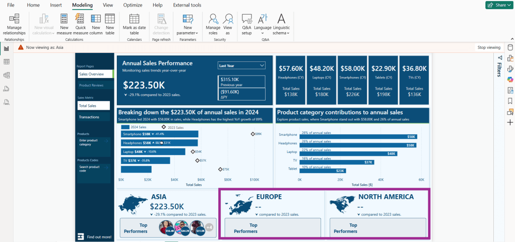


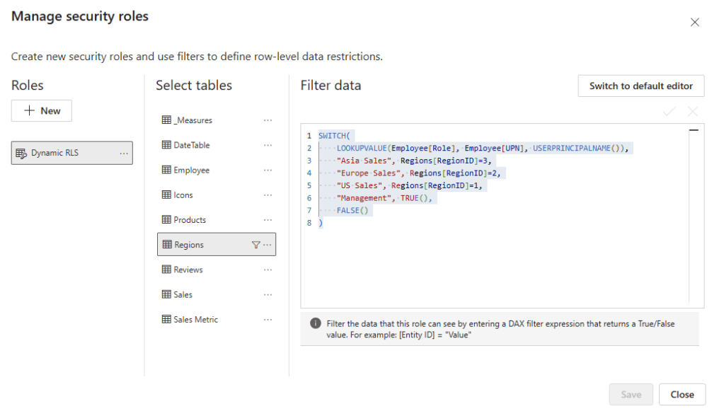

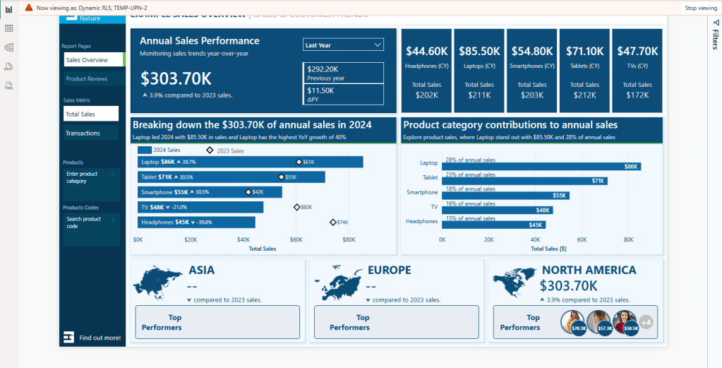
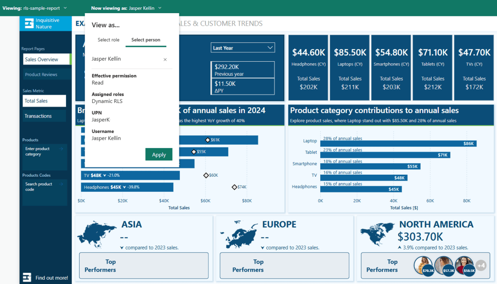
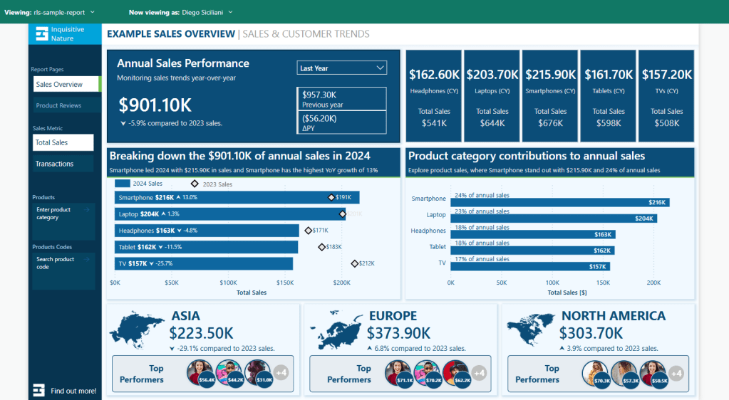


 100vw, 1000px”/></figure>
</div>
<div class=)