Explore how to deliver personalized insights without losing the bigger picture.
This post is part two of a series on Power BI security patterns. Check out part one for a beginner-friendly overview of row-level security in Power BI.
This post will take our security design pattern one step further.
While row-level security (RLS) allows us to restrict data based on user roles and identities, there are times when we don’t want everything locked down. Occasionally, users need to see their data in relation to broader metrics, such as company-wide totals or averages.
In the sample report, regional sales teams should see detailed information only about their assigned region and the total sales for other regions.
In the previous post, we noted that standard RLS filters out other regional sales, preventing the totals from other regions from being displayed. This is where partial RLS becomes useful and can fulfill this requirement.
In this post, we will walk through:
What Partial RLS is and when to use it
A real-world scenario that calls for it
Key limitations and design tips
What is Partial Row-Level Security
Row-Level Security (RLS) applies filters at the dataset level throughout the entire datamodel for a user. This means that if RLS restricts a user to view only sales data for the North America region, every visual and measure in the report will be automatically limited to data associated with the North America region.
Using RLS is effective for data protection, but it can be a limitation when a report needs to provide a broader context to the user.
With report-level filters and slicers, DAX provides functions like ALL() and REMOVEFILTERS(), which can bypass data filtering. However, DAX expressions cannot bypass RLS.
Partial RLS is a design approach in Power BI that helps mitigate RLS’s limitations when necessary. The concept involves separating secured data from summary data, allowing users to view filtered and unfiltered insights side by side.
To achieve this, we will create a summary table (Annual Sales Summary (Regional)) within our datamodel. This summary table will aggregate the total sales across all regions and will not be affected by RLS filters. It provides overall totals that offer essential context when needed, while the RLS still restricts access to detailed sales information within our sales table.
In our sample report, RLS is applied to the Region table, and the RLS filter propagates to the Sales table.
In the datamodel, filters applied to the Region table do not directly impact the rows in our summary table. This means that users can see the total aggregated sales for all regions while still having RLS filters applied to the detailed sales data.
Use Case: Display Regional Total Sales and Percentage of Company-Wide Sales
We are designing a Power BI report for a global sales team. Each regional sales team member should only be able to:
View detailed transaction-level data for their assigned region
See key metrics, like total sales for all regions, to provide a broader context
Step 1: Apply RLS rules to the Region table
First, we define our RLS rules in Power BI Desktop, see Power BI Row-Level Security Explained: Protect Data by User Role.
The implemented RLS rules filter the Sales table and limits access to the appropriate region per user.
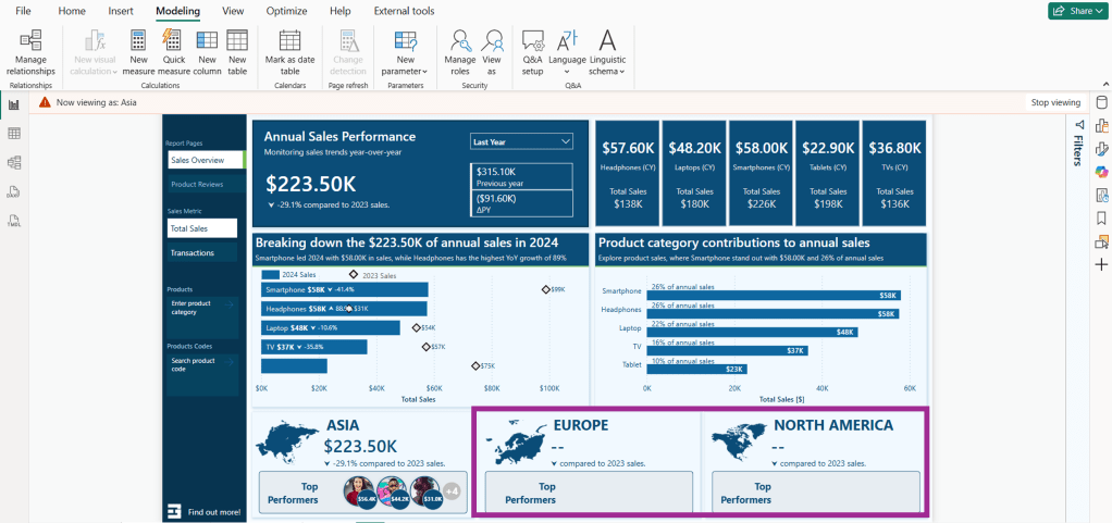
A challenge arises when we implement RLS while also trying to meet the second requirement. As shown in the image above, the total sales figures for Asia and North America appear blank when viewing the report with the Europe role.
This is because the measure used to calculate the totals uses the following expression.
Total Sales = SUM(Sales[Amount])
When RLS is implemented, users only have access to data specific to their region. For instance, when the Total Sales measure is evaluated, the Sales table is filtered to include only the sales data associated with the Europe sales region. As a result, the Total Sales measure reflects the total sales relevant to the user’s region rather than the entire dataset.
Step 2: Create a summary table
To address this issue and meet our requirements, we will create a calculated summary table in our data model. This table will store pre-aggregated total sales and total transactions by year and region.
This table does not have a direct relationship with the Region table, which is under RLS control, and our RLS roles will not filter it.
Step 3: Build dynamic DAX measures
We can now utilize this table in our measures to establish company-wide or cross-region metrics while ensuring the security of the underlying transactional data.
We first create two new measures within our datamodel to calculate the entire company’s total sales and transaction counts.
We can use these base measures to dynamically display total sales or total transactions for all regions in the data cards at the bottom of the report, utilizing the following expression and visual filters.
Note: we can also use the fact that RLS filters the region table and expressions such as COUNTROWS() or SELECTEDVALUE() to hide or show the top performers data card.
RLS still applies to the top-row visuals and bar charts, which provide detailed breakdowns of regional sales. However, the summary table enables us to present the total sales for all regions within the data card along the bottom of our report.
Step 4: Combine RLS-filtered and unfiltered measures
The non-RLS base measures can also compare regional total sales or transactions based on the current user (RLS-filtered) as a percentage of the company-wide measure (unfiltered).
% of CompanyWide Sales =
DIVIDE([Total Sales], [Total Sales (nonRLS)])
Considerations and Limitations
While the partial RLS pattern can enhance the usability and insightfulness of our Power BI report, we must consider its capabilities and limitations, as well as the associated technical and design trade-offs.
Partial RLS does not override existing RLS filters; instead, it isolates high-level summary data in a separate table unaffected by these filters. This allows partial RLS to be used for comparisons or to add additional global context without exposing detailed row-level information.
1) When implementing partial RLS, it’s important to remember that datamodel relationships matter. The summary table must be included in the datamodel to ensure that cross-filtering from tables affected by RLS does not impact it. If the summary table is related to a table with RLS filters applied at the datamodel level, it will also be subject to the RLS filters.
2) When combining measures filtered by RLS with unfiltered measures, users may need assistance interpreting the visuals associated with these measures. Visual cues or proper labeling, such as Total Sales Across All Regions versus Your Regional Sales may be necessary to help clarify what users are seeing.
3) Partial RLS can be implemented efficiently when the summary table is small and pre-aggregated without complex DAX filtering. However, keep in mind that if the summary table grows too large or includes too much granularity, it may negatively impact the performance of our reports.
4) Implementing partial RLS can add complexity when creating DAX measures. Since RLS is enforced on our Sales table, any attempts to calculate totals, even when using functions like ALL() or REMOVEFILTER(), will still be subject to our RLS rules. While partial RLS offers additional insights into our data, it does not grant any additional access.
5) We must assess edge cases, such as data gaps or undefined user roles. If a user is assigned a role that is not properly mapped in our datamodel, they may encounter an empty report or access to detailed data. We should always validate our RLS roles to ensure they function as expected.
Wrapping Up
Partial RLS is a design approach used in cases where RLS filtering restricts our ability to give users a broader context for their data. This approach allows us to ensure secure access to detailed, role-specific data while providing users insight into the overall picture and how their data fits into a larger context.
We can provide contextual insights without revealing specific row details by utilizing partial row-level security, enabling us to create more comprehensive and insightful reports.
Row-Level Security (RLS) enables us to filter data at the row level, but it does not allow us to secure entire tables or columns within our datamodel. Make sure to check back for the next post, or better yet, subscribe so you don’t miss it!
In the next post, we will explore Object-Level Security (OLS) in Power BI. OLS is essential because it allows us to secure specific tables and columns from report viewers.
If you’d like to follow along and practice these techniques, Power BI sample reports are available here: EMGuyant GitHub – Power BI Security Patterns.
Thank you for reading! Stay curious, and until next time, happy learning.
And, remember, as Albert Einstein once said, “Anyone who has never made a mistake has never tried anything new.” So, don’t be afraid of making mistakes, practice makes perfect. Continuously experiment, explore, and challenge yourself with real-world scenarios.
If this sparked your curiosity, keep that spark alive and check back frequently. Better yet, be sure not to miss a post by subscribing! With each new post comes an opportunity to learn something new.
Discover how to personalize your reports and show each user only the data they require in just a few clicks.
When creating reports for teams across various departments or regions, it’s important to recognize that not everyone needs or wants to see the same data. This is where Row-Level Security (RLS) becomes essential.
We can use RLS to restrict data access for report viewers based on their identity. This eliminates the need to create separate reports for different departments or regions. With RLS, we can use a single report and dataset to generate personalized views for each individual or role.
In this guide, we will walk through:
What RLS is and why we should use it
Static vs Dynamic RLS
Step-by-step examples for each
Limitations and Considerations when implementing RLS
By the end of this guide, you will better understand RLS, its applications, and its limitations. Additionally, a PBIX example file will be provided for in-depth, hands-on exploration of this topic.
What is Row-Level Security
Row-level Security (RLS) within Power BI restricts data access for report viewers based on their identity by enabling us to establish rules within our data model to filter data rows.
Consider it as always adding another filter to the appropriate users. These filters are applied at the dataset level, ensuring that users can only see the information they can access, regardless of how they interact with the report
It is important to note that users who have more than viewer permissions to the Power BI workspace have access to the entire semantic model. RLS only restricts data access for users with Viewer permissions.
Why use Row-Level Security
There are several key advantages to using Row-Level Security (RLS) when creating our reports.
Security and Privacy
RLS helps prevent users from seeing data they shouldn’t have access to. This can become especially important when the dataset includes sensitive data.
Efficiency and Scalability
Managing separate reports for different departments or roles can be cumbersome. With RLS, we can create and customize one report for each user role. This approach is easier to maintain, scales better, and reduces the likelihood of inconsistencies and errors.
Improved User Experience
Users no longer need to apply slicers or filters to view only their data of interest. RLS automatically handles this when the report is rendered, resulting in a cleaner and more user-friendly report.
Static Row-Level Security
Static Row-Level Security (RLS) is the most straightforward form of RLS. In this approach, we manually define which users can access specific rows of data, usually by applying filters based on criteria such as Region or Department. This method works well when there is a small group of users and the access rules do not change frequently.
Step-by-Step: Static RLS
Static RLS applies a fixed value in the DAX filter when rendering our report. Configuring static RLS involves several steps.
1. Creating RLS roles in Power BI Desktop To create RLS roles in Power BI Desktop, navigate to the Modeling tab and select Manage Roles.
Then, we select + New under Roles on the manage security roles dialog box. For this sample report, we create a role for each sales region.
We give each role a descriptive name, select the table to which the filter is applied, and create the filter condition.
After each role is created, any user we assign to the Asia, Europe, or United States role will only see data filtered to that specific region.
This approach is considered Static RLS since we use a static value to define each role.
2. Testing the roles in Power BI Desktop Within Power BI Desktop, we can test each role to validate it by selecting the View as option on the modeling tab.
After selecting a role, we can see the report rendered as if we are a member of that role.
3. Deploying the report to the Power BI Service Once we create and validate the roles, we publish the report to the Power BI Service as with any other report.
4. Add members to the role in the Power BI Service To add a member to the role in the Power BI Service, we must navigate to the workspace where we published the report. We locate the semantic model and select the More options ellipsis (…) and then Security.
Within the Row-Level Security screen, we add users or security groups to each role we created. RLS rules will not apply to users who have access to the report but have not been added to a role.
5. Testing the roles in the Power BI Service On the Security screen, we select the More options ellipsis (…) next to each role and then Test as role.
Once all roles have been validated, we have successfully implemented static row-level Security in Power BI.
Dynamic Row-Level Security
While static RLS can be great for smaller teams, it doesn’t scale well. Manually assigning roles to individuals quickly becomes unmanageable.
Dynamic RLS solves this issue using a User Access Table or a field that defines each user’s role inside our data model. The report utilizes this table to filter itself based on who is viewing the report.
For this example, our data model has an Employee table that contains each employee’s user principal name and role (e.g., Asia Sales, Europe Sales, US Sales, Management, or blank). We utilize this information to implement dynamic RLS by looking up the user’s role based on the user principal name of the viewer currently signed in.
Step-by-Step: Dynamic RLS
1. Set up a dynamic role using DAX Navigate to the Modeling tab and select Manage Roles. Then, in the Manage Security Roles dialog box, select + New under Roles.
We name the role, select the table to which the filter is applied, and, this time, rather than creating a static filter condition, select Switch to DAX editor to create our dynamic rule.
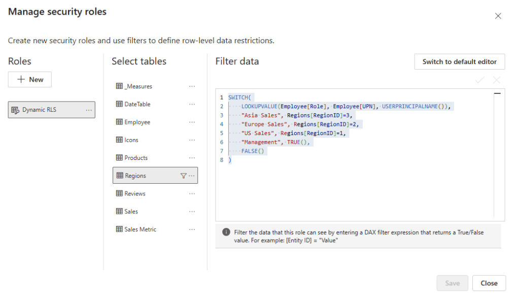
We filter the Region table based on the current user’s role using the following DAX expression:
The DAX expression looks up the user’s Role based on the current user’s user principal name (e.g. email).
2. Testing the dynamic filter After creating the rule, we must test and validate that it functions as expected. We navigate to the Modeling tab and select View as. Then, in the dialog box, we check the Other User option and enter a user’s email. We also check the dynamic filter rule we just created and select OK.
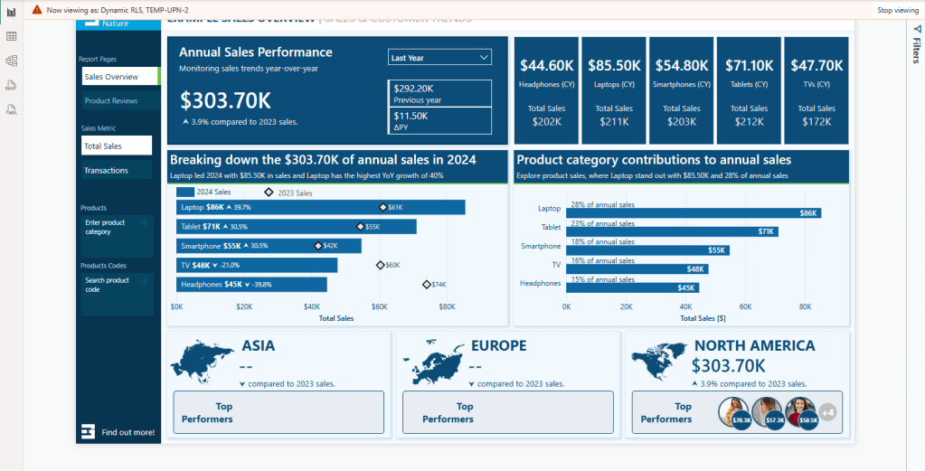
The report will refresh, and we will validate that the TEMP-UPN-2 user, who has the role of US Sales, sees data only for their assigned region.
3. Publish the report and add members to the role We publish the report to the Power BI Service. Then, to add members to the role in the Power BI Service, we must navigate to the workspace where we published the report. We locate the semantic model and select the More options ellipsis (…) and then Security.
Within the Row-Level Security screen, similar to what we did for static RLS, we can add users or security groups to each role we created.
Since we may implement dynamic row-level Security for better scalability, assigning a security group when adding members can be beneficial. Better yet, this security group can also give users their Viewer access to the report or app.
4. Validate roles in the Power BI Service On the Security screen, we select the More options ellipsis (…) next to each role and then Test as role.
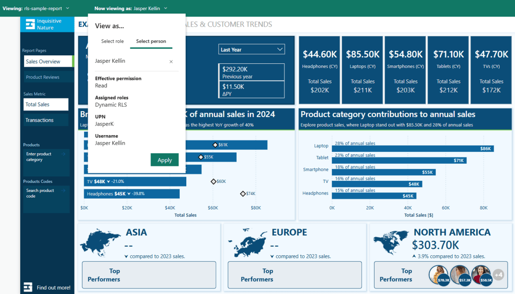
Then, at the top, we select Now viewing as and Select a person to validate that the RLS is functioning as expected. We will view the report as Jasper (TEMP-UPN-2) as we did in Power BI Desktop.
Note: The TEMP-UPN-# provided in the sample file will only function for testing in Power BI Desktop without requiring an actual email address. The UPN field must contain actual user email addresses to validate in the Power BI Service.
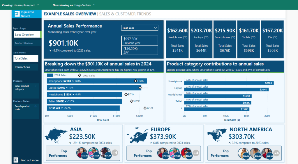
We can also validate the report for Diego (TEMP-UPN-4), who is assigned the Management role and should be able to see data for all sales regions
One last consideration is what happens when a user intentionally or unintentionally has access to view the report but does not have a Role defined in the Employee table.
If we review the DAX expression used for the filter:
The last value, or the default if no other condition is true, is set to FALSE(). This means that if a user is in the Employee table but either does not have a role or their role doesn’t match one defined in the rule, the report will be empty.
When testing the report, Grady (TEMP-UPN-5) is contained in the Employee table but does not have a role assigned.
Now that everything is working as expected, we have successfully implemented dynamic row-level Security. The benefit is that by using dynamic RLS, we replace four roles with a single rule applied dynamically based on the current user. Additionally, we can add an extra layer and hide data for users who have access to the report but are not assigned a role in the Employee table.
Considerations and Limitations
Before implementing RLS across our reports, it is important to consider and evaluate the impacts of RLS limitations.
A list of limitations can be viewed here:
It’s also important to understand when Row-Level Security (RLS) is and is not the right tool.
We may consider publishing multiple semantic models if we have only a few simple RLS rules. For example, if we have just two sales regions, we might publish a separate semantic model for each region. Although the semantic models do not enforce RLS, we can use query parameters to filter the source data to the specific sales region. The use of query parameters would still allow us to publish the same model while displaying the relevant data for each region.
Advantages of not using Row-Level Security (RLS) include:
Improved Query Performance: With fewer filters applied to the data model, queries can run faster.
Smaller Models: While avoiding RLS may increase the number of models, each individual model is generally smaller, which can enhance query performance and data refresh responsiveness.
Full Access to Power BI Features: Certain features, like “Publish to the Web”, do not work with RLS.
However, there are also disadvantages to not implementing RLS:
Multiple Workspaces Required: Each user audience for reports may require its own workspace.
Content Duplication: Reports and dashboards must be created in each workspace, leading to redundancy and increased maintenance efforts.
Lack of Consolidated View: Users who belong to multiple report user audiences must open various reports, resulting in no single, consolidated view of their data.
Wrapping Up
Row-Level Security (RLS) is a valuable feature in Power BI that enables us to protect and customize report data according to the identity of the report viewer. With static RLS, we can implement straightforward, fixed access rules, while dynamic RLS offers a more scalable and flexible solution. RLS allows us to provide tailored insights that meet the specific needs of different users.
It’s important to remember that Row-Level Security only filters rows in a table and does not limit access to model objects like tables or columns. If your requirements involve hiding entire tables or specific columns within a table, you should consider using Power BI Object-Level Security (OLS).
RLS can sometimes be overly restrictive when it comes to broader calculations. For example, we could display the total sales for each region to all users or calculate the percentage of total sales across all regions. However, RLS rules filter these total sales values, leading to complications. This is where the concept of partial RLS comes into play, allowing us to secure specific data while still accessing global context for certain calculations.
Stay tuned and subscribe so you won’t miss upcoming posts in this series, focusing on the partial RLS design pattern and object-level security.
If you’d like to follow along and practice these techniques, Power BI sample reports are available here: EMGuyant GitHub – Power BI Security Patterns.
Thank you for reading! Stay curious, and until next time, happy learning.
And, remember, as Albert Einstein once said, “Anyone who has never made a mistake has never tried anything new.” So, don’t be afraid of making mistakes, practice makes perfect. Continuously experiment, explore, and challenge yourself with real-world scenarios.
If this sparked your curiosity, keep that spark alive and check back frequently. Better yet, be sure not to miss a post by subscribing! With each new post comes an opportunity to learn something new.
Elevate Your Power BI Reports with Context-Aware Insights
Welcome, to another journey through the world of DAX, in this post we will be shining the spotlight on the ISINSCOPE function. If you have been exploring DAX and Power BI you may have encountered this function and wondered its purpose. Well, wonder no more! We are here to unravel the mysteries and dive into some practical example showing just how invaluable this function can be in our data analysis endeavors.
If you are unfamiliar DAX is the key that helps us unlock meaningful insights. It is the tool that lets us create custom calculations and serve up exactly what we need. Now, lets focus on ISINSCOPE, it is a function that might not always steal the show but plays a pivotal role, particularly when we are dealing with hierarchies and intricate drilldowns in our reports. It provides us the access to understand at which level of hierarchy our data is hanging out, ensuring our calculations are always in tune with the context.
For those of you eager to start experimenting there is a Power BI report pre-loaded with the sample data used in this post ready for you. So don’t just read, follow along and get hands-on with DAX in Power BI. Get a copy of the sample data file (power-bi-sample-data.pbix) here:
Exploring the ISINSCOPE Function
Let’s dive in and get hand on with the ISINSCOPE function. Think of this function as our data GPS, it helps us figure out where we are in the grand scheme of our data hierarchies.
So, what exactly is ISINSCOPE? In plain terms, it is a DAX function used to determine if a column is currently being used in a specific level of a hierarchy or, put another way, if we are grouping by the column we specify. The function returns true when the specified column is the level being used in a hierarchy of levels. The syntax is straightforward:
ISINSCOPE(column_name)
The column_name argument is the name of an existing column. Just add a column that we are curious about, and ISINSCOPE will return true or false depending on whether that column is in the current scope.
Let’s use a simple matrix containing our Region, Product Category, and Product Code to set up a hierarchy and see ISINSCOPE in action with the following formula.
This formula uses ISINSCOPE in combination with SWITCH to determine the current context, and if true returns a text label indicating what level is in context.
But why is this important? Well, when we are dealing with data, especially in a report or a dashboard, we want our calculations to be context-aware. We want them to adapt based on the level of data we are looking at. ISINSCOPE allows us to create measures and calculated columns that behave differently at different levels of granularity. This helps provide accurate and meaningful insights.
Diving Deeper: How ISINSCOPE Works
Now that we have got a handle on what ISINSCOPE is, let’s dive a bit deeper and see how it works. At the heart of it ISINSCOPE is all about context, specifically, row context and filter context.
For an in depth look into Row Context and Filter Context check out the posts below that provide all the details.
For our report we are interested in analyzing the last sales date of our products, and want this information in a matrix similar to the example above. We can easily create a Last Sales Date measure using the following formula and add it to our matrix visual.
Last Sales Date = MAX(Sales[SalesDate])
This provides a good start, but not quite what we are looking for. For our analysis the last sales date at the Region level is too broad and not of interest, while the sales date of Product Code is too granular and clutters the visual. So, how do we display the last sales date just at the Product Category (e.g. Laptop) level? Enter ISINSCOPE.
Let’s update our Last Sales Date measure so that it will only display the date on the product category level. Here is the formula.
Product Last Sales Date =
SWITCH(
    TRUE(),
    ISINSCOPE(Products[Product Code]), BLANK(),
    ISINSCOPE(Products[Product]), FORMAT(MAX(Sales[SalesDate]),"MM/dd/yyyy"),
    ISINSCOPE(Regions[Region]), BLANK()
)
We use SWITCH in tandem with ISINSCOPE to determine the context, and if Product is in context the measure returns the last sales date for that product category. However, at the Region and Product Code levels the measure will return a blank value.
The use of ISINSCOPE helps enhance the matrix visual preventing it from getting over crowded with information and ensuring that the information displayed is relevant. It acts as a smart filter, showing or hiding data based on where we are in a hierarchy, making our reports more intuitive and user-friendly.
ISINSCOPE’s Role in Hierarchies and Drilldowns
When we are working with data, understanding the relationship between parts and the whole is crucial. This is where hierarchies and drilldowns come into play, and ISINSCOPE is the function that helps us make sense of it all.
Hierarchies allow us to organize our data in a way that reflects real-world relationships, like breaking down sales by region, then product category, then specific products. Drilldowns let us start with a broad view and then zoom in on the details. But how do we keep our calculations accurate at each level? You guessed it, ISINSCOPE.
Let’s look at a DAX measure that leverages ISINSCOPE to calculate the percentage of sales each child represents of the parent in our hierarchy.
Percentage of Parent =
    VAR AllSales =
        CALCULATE(Sales[Total Sales], ALLSELECTED())
    VAR RegionSales =
        CALCULATE([Total Sales], ALLSELECTED(), VALUES(Regions[Region]))
    VAR RegionCategorySales =
        CALCULATE([Total Sales], ALLSELECTED(), VALUES(Regions[Region]), VALUES(Products[Product]))
    VAR CurrentSales = [Total Sales]

RETURN
SWITCH(TRUE(),
    ISINSCOPE(Products[Product Code]), DIVIDE(CurrentSales, RegionCategorySales),
    ISINSCOPE(Products[Product]), DIVIDE(CurrentSales, RegionSales),
    ISINSCOPE(Regions[Region]), DIVIDE(CurrentSales, AllSales)
)
The Percentage of Parent measure uses ISINSCOPE to determine the current level of detail we are working with. If we are viewing our sales by region the measure calculates the sales for the region as a percentage of all sales.
But the true power of ISINSCOPE begins to reveal itself as we drilldown into our sales data. If we drilldown into each region to show the product categories we see that the measure will calculate the sales for each product category as a percentage of sales for that region.
And then again, if we drilldown into each product category we can see the measure will calculate the the sales of each product code as a percentage of sales for that product category within the region.
By incorporating this measure into our report, we help ensure that as we drilldown into our data the percentages are always calculated relative to the appropriate parent in our hierarchy. This allows us to provide accurate measures that provide the appropriate context, making our reports more intuitive and insightful.
ISINSCOPE is the key element to maintaining the integrity of our hierarchical calculations. It ensures that as we navigate through different levels of our data our calculations remain relevant and precise, providing a clear understanding of how each part contributes to the whole.
Best Practices for Leveraging ISINSCOPE
When it comes to DAX and ISINSCOPE a few best practices can ensure that our reports are accurate, performant, and user-friendly. Here are just a few things that can help us make the most out of ISINSCOPE:
Understand Context: Before using ISINSCOPE, make sure to have a solid understanding of row and filter context. Knowing which context we are working with will help us use ISINSCOPE effectively.
Keep it Simple: Start with simple measures to understand how ISINSCOPE behaves with our data. Complex measures can be built up gradually as we become more comfortable with the function.
Use Variables: Variables can make our DAX formulas easier to read and debug. They also help with performance because they store a result of a calculation for reuse.
Test at Every Level: When creating measures with ISINSCOPE, test them at every level, this helps ensure that our measures work correctly no matter how the users interact with the report.
Combine with Other Functions:ISINSCOPE is often used in combination with other DAX functions. Learning how it interacts with functions like SWITCH, CALCULATE, FILTER, and ALLSELECTED will provide us more control over our data.
Wrapping up
Throughout our exploration of the ISINSCOPE function we have uncovered its pivotal role in managing data hierarchies and drilldowns providing for accurate and context-sensitive reporting. Its ability to discern the level of detail we are working with allows for dynamic measures and visuals that adapt to user interactions, making our reports not just informative but interactive and intuitive.
With practice, ISINSCOPE will become a natural part of your DAX toolkit, enabling you to create sophisticated reports that meet the complex needs of any data analysis challenge you might face.
For those looking to continue their journey into DAX and its capabilities there is a wealth of resources available, and a good place to start is the DAX Reference documentation.
I have also written about other DAX functions including Date and Time Functions, Text Functions, an entire post focused on the CALCULATE function and an ultimate guide providing a overview of all the DAX function groups.
Thank you for reading! Stay curious, and until next time, happy learning.
And, remember, as Albert Einstein once said, “Anyone who has never made a mistake has never tried anything new.” So, don’t be afraid of making mistakes, practice makes perfect. Continuously experiment and explore new DAX functions, and challenge yourself with real-world data scenarios.
If this sparked your curiosity, keep that spark alive and check back frequently. Better yet, be sure not to miss a post by subscribing! With each new post comes an opportunity to learn something new.
Ever wondered how to tackle Power BI data challenges? Find out how I transformed this challenge into an opportunity to learn and then into an achievement.
Over the last two years I have ended each of my posts with two main messages, (1) stay curious and happy learning, and (2) continuously experiment, explore and challenge yourself. However, at times it can be hard to identify open ended opportunities to fulfill these.
One opportunity available is participating in various data challenges. I recently participated in and was a top 5 finalist in the FP20 Analytics ZoomCharts Challenge 15. This data challenge was a HR data analysis project with a provided dataset to explore and a chance to expand your report development skills.
What I enjoyed about the challenge is along with the dataset, it provided a series of questions to help guide the analysis and provide direction and a focus for the report.
Here is the resulting report submitted to the challenge and discussed in this post. View, interact, and get the PBIX file at the link below.
About the Challenge
The FP20 Analytics challenge was in collaboration with ZoomCharts and provided an opportunity to explore custom Power BI ZoomCharts drill down visuals.
The requirements included developing a Power BI report with a default canvas size, a maximum of 2 pages, and include at least two ZoomCharts Drill Down Visuals.
The goal of the challenge was to identify trends within the dataset and develop a report that provides viewers the answers to the following questions.
How diverse is the workforce in terms of gender, ethnicity, and age?
Is there a correlation between pay levels, departments, and job titles?
How about the geographic distribution of the workforce?
What is the employee retention rate trend yearly?
What is the employee retention rate in terms of gender, ethnicity, and age?
Which business unit had the highest and lowest employee retention rate?
Which business unit and department paid the most and least bonuses annually?
What is the annual historical bonus trend? Can we show new hires some statistics?
How about the pay equity based on gender, ethnicity, and age?
What is the employee turnover rate (e.g., monthly, quarterly, annually) since 2017?
There are countless ways to develop a Power BI report to address these requirements. You can see all the FP20 Analytics ZoomCharts Challenge 15 report submissions here.
This post will provide an overview and some insight into my approach and the resulting report.
Understanding the Data
With any analysis project, before diving into creating the report, I started by exploring and getting an understanding of the underlying data. The challenge provided a single table dataset, so I loaded the data into Power BI to use the Power Query editor’s column distribution, column profile, and column quality to help get an understanding of the data.
Using these tools, I was able to identify missing values, data errors, data types, and get a better sense of the distribution of the data. This initial familiarity will help inform the analysis and help identify what data could be used to answer the requirement questions, identify data gaps, and help ask the right questions to create an effective report.
The dataset contained 16 columns and provided the following data on each employee.
Employee/Organizational characteristics
Employee ID, full name, job title, department, business unit, hire date, exit date
Demographic information
Salary information
Annual salary and bonus percentage
Location information
City, country, latitude, longitude
The dataset was already clean. No columns contained any errors that had to be addressed, and the only column that had empty/null values was exit date, which is expected. One thing I noted at this stage is that the Employee ID column did not provide a unique identifier for an employee.
Additionally, I used a temporary page in the Power BI report containing basic charts to visualize distributions and experiment with different types of visuals to see which ones best represent the data and help reach the report objectives. Another driver of using this approach was start experimenting with and understanding the different ZoomCharts and their customizations.
Identifying Key Data Attributes
Once I had a basic understanding of the dataset, it is always tempting to jump right into data manipulation and visualization. However, I find it helpful at this stage to pause and review the questions the report should answer.
During this review I was able to further define these goals, with my new understanding of the data, which guided the selection of relevant data within the dataset.
I then broke the questions down into 3 main areas of focus and began to think about what data attributes within the dataset can be used, and possibility more importantly, think about what is missing or how I can enrich the dataset to create a more effective report.
Workforce Diversity (Question #1 and #3)
To analyze the workforce diversity, the dataset provided a set of demographic information fields that aligned with these questions.
The next set of questions I focused on revolved around the salary and bonus structure of the organization. I identified I could use the demographic fields along with the salary information to provide insights.
Employee Retention & Turnover (Questions #4, #5, #6, and #10)
The dataset did not directly include the retention and turnover rates and required enriching the dataset to calculate these values. To do this I used the hire date and exit date. Once calculated I am able to add an organization context to the analysis by using the business unit, department, and job title attributes.
Dataset Enrichment
After identifying key data attributes that can be used to answer the objectives of the report, it becomes clear that there are opportunities for enriching the dataset to aid in making a more effective visualization (e.g. age bins) and address data gaps or require calculations (e.g. employee retention and turnover).
For this report I achieved this through the use of both calculated columns and measures.
Creating Calculated Columns
Calculated columns are a great tool to add new data based on existing information in the dataset. For this report I created 7 calculated columns which were required because I wanted to use the calculated result in axes of report visuals or as a filter condition in a DAX query.
Age Bin: categorized the employee’s age based on their age decade (20s, 30s, 40s, 50s, or 60s). Here I used a calculated column rather than the built-in data group option to provide more flexibility and control over the bins.
Tenure (Years): while exploring salary across departments and demographic categories, I also wanted to include context for how long the employee has been with the organization as this might influence their salary and/or bonus.
Total Compensation: the dataset provided annual salary and bonus percent. The bonus percent was helpful when examining this attribute specifically, however when analyzing the organization pay structure across groups, I found the overall page (salary + bonus) to be more insight and provide the entire picture of the employee’s compensation.
Employee Status: the dataset included current and past employees. To ease analysis and provide the users the ability to filter on the employee’s status I included a calculated column to label the employee as active or inactive.
Abbreviation: the report required providing insight broken down by business unit, country, and department all of which could have long names and clutter the report. For each of these columns I included a calculated column providing a 3-letter abbreviation to be used in the report visuals.
Defining Measures
In addition to calculated columns, the report included various calculated measures. These dynamic calculations are versatile and aid the interactive nature of the Power BI report.
For this report I categorized my measure into the following main categories.
Explicit Summaries: these measures are not strictly required. However, I prefer the use of explicit aggregation measures over implicit auto-aggregation measures on the visuals due to the increased flexibility and reusability.
Average Total Compensation
Average Bonus ($)
Average Bonus (%)
Highest Average Bonus % (Dept) Summary
Lowest Average Bonus % (Dept) Summary
Maximum Bonus %
Minimum Bonus %
Average Annual Salary
Maximum Annual Salary
Median Annual Salary
Minimum Annual Salary
Active Employee Count
Total count
Each ethnicity count
Male/Female count
Inactive Employee Count
Report Labels: these measures were used to add additional context and information to the user when interacting with drill down visuals. On the drill down visuals when a user selects a data category or data point the visual drills down and shows the next level of the data hierarchy. What is lost, is what top level category was selected, so these labels are used to provide that information.
Selected Age Bin
Selected Business Unit Retention
Selected Business Unit Turnover
Selected Dept Retention
Selected Dept Turnover
Retention & Turnover: 4 of the report objectives revolved around employee retention and turnover rates. The dataset only provided employee hire dates and exits which are used to calculate these values.
Cumulative Total Employee Count (used in retention rate)
Employee Separations (used in retention rate)
Employee Retention
Brazil Retention Rate
China Retention Rate
United Sates Retention Rate
Employee Turnover Rate
Brazil Turnover Rate
China Turnover Rate
United States Turnover Rate
Report Development
After understanding the dataset, identifying key data attributes, and enriching the dataset I moved onto the report development.
Report Framework
From the requirements I knew the report would be 2 pages. The first focused on Workforce Diversity and Salary & Bonus Structure. The second focused on Employee Retention & Turnover.
I started the report with a two-page template that included all the functionality of an expandable navigational element. For details on how I created this, and where to find downloadable templates see my post below.
This navigation is a compact vertical navigation that can be expanded to provide the user page titles and was highlighted as a strong point of the report in the Learn from the Best HR Reports: ZoomCharts TOP Picks.
Then I selected the icons used in the navigation and updated the report page titles on each page and within the expanded navigation.
Once the template was updated for the specifics of this report, I applied a custom theme to get the aesthetic just right. For more on creating custom themes and where to find downloadable themes, including the one used in this report (twilight-moorland-plum), see the following post.
After updating the navigation template and implementing the report theme, I was set with a solid foundation to begin adding report visuals.
Demographic & Compensation Analysis
The first page of the report focused on two main objectives, the demographic distribution of the workforce and an in-depth analysis of the organizational compensation structure.
Demographic Distribution
The first objective was to provide the user insights into the diversity of the workforce in terms of gender, ethnicity, and age. This was a perfect fit for the Drill Down Combo PRO (filter) by ZoomCharts visual. The visual displays the percentage of the workforce broken down by gender and displayed by employee age. Each age bin then can be drilled into to reveal additional insights into the age bins ethnicity make up.
In addition to the core visual, I included a card visual displaying the Selected Age Bin measure to provide context to the data when viewing an age bins ethnicity make up.
Geographic Distribution
The other component of this analysis was objective #3 focused on the geographic distribution of the workforce. In my submitted report this comprised of two elements the first and primary visual is the Drill Down Map PRO (Filter) by ZoomCharts visual. The second is a Drill Down Combo Bar PRO (Filter) by ZoomCharts visual.
The Map visual shows the ethnicity of the workforce as a percentage of the total workforce for each geographic location.
This visual in the report had noted limitation. Mainly the initial view of the map did not show all the data available. The inclusion of the country break provided an effective means to filter to a specific country however, it crowded the visual. Additionally, the colors in the report for the ethnicity groups of Asian and Black used the same colors used throughout the report for Male and Female which can be a source of confusion. See the Feedback and Improvements sections to see the updates to more effectively visual this data.
The first component of the compensation structure analysis was to examine the median total compensation (salary + bonus) by departments, business units and job title. The second was to provide insights into compensation equity among the demographic groups of age, ethnicity, and gender.
I used the Drill Down Combo PRO (Filter) visual to analyze the median total compensation for each organizational department broken down by gender. Each department can be drilled into to extract insights about the business unit and further drilled into each job title. I also included the average tenure in years of the employees within each category to better understand the compensation structure of the organization.
This report section contained another Drill Down Combo PRO (Filter) visual to provide insights on the median total compensation by ethnicity and gender. These two visuals when used in tandem and leveraging cross-filtering can provide a nearly complete picture of the compensation structure between departments and equity across demographic groups.
When the two Median Total Compensation visuals are used along with the demographic and geographic distributions visuals a full understanding and in-depth insights can be extracted. The user can interact and cross-filter all of these visuals to tailor the insights to meet their specific needs.
The second component of the compensation structure analysis was to provide an analysis of departmental bonuses and historical bonus trends.
To provide detailed insights into the bonus trends I utilized a set of box and whisker plots to display granular details and card visuals to provide high-level aggregations. I will note that box and whisker plots may not be suitable in every scenario. However, for an audience that is familiar and comfortable interpreting these plots they are a great tool and were well suited for this analysis.
Workforce Retention & Turnover
The second page of the report focused on the analysis of employee retention and turnover. For this report the retention rate was calculated as the percentage of employees that remained with the organization during a specific evaluation period (e.g. annually) and the turnover rate is the rate at which employees left the organization expressed as a percentage of the total number of employees.
For this analysis, I thought it was key to provide the user and quick and easy way to flip between these metrics depending on their specific requirement. I did this by implementing a button experience at the top of the report, so the user can easily find and reference what metric they are viewing.
Another key aspect to enhance the clarity of the report is the visuals remain the same regardless of the metric being viewed. This eases the transition between the different views of the data.
Across the top of the report page is a set of Drill Down Combo Bar PRO (Filter) visuals to analyze the selected metric by department and business unit on the left and age, gender, and ethnicity in the right-side grouping.
Each of these visuals also use the threshold visual property to display the average across all categories. This provides a clear visual indicator of how a specific category is performing compared to the overall average (e.g. retention for the R&D Business Unit is slightly worse (87%) than the organizational average of 92%).
All of these visuals can be used to cross-filter each other to get highly detailed and granular insights when required.
In addition to examining the retention and turnover rate among organizational and demographic groups there was an objective to provide insight to the temporal trends of these metrics. The Drill Down Timeline PRO (Filter) visual was perfect for this.
This visual provides a long-term view of the retention and turnover rate trend while providing the user an intuitive and interactive way to zoom into specific time periods of interest.
Additional Features
Outside to of the main objectives of the report outlined by the 10 specified questions there were additional insights, features, and functionalities built into the report to enhance usability and the user experience.
On the Demographic & Compensation Analysis page this included a summary statistics button to display a high-level overlay of demographic and salary summaries.
On both pages of the report there was also a clear slicer button to clear all selected slicer values. However, this clear slicer button did not reset the report to an initial state or reset data filters due to user interactions with the visuals. See the Feedback and Improvements section for details and the implemented fix.
Lastly, each page had a guided tutorial experience to inform new users about the report page and all the different features and functionalities the report and the visuals offered.
There are various other nuanced and detailed features of this reports and too much to all cover here. But please check out and interact with the report here:
Feedback and Improvements
My submitted report was discussed in the Learn from the Best HR Reports: ZoomCharts TOP Pick webinar which provided excellent feedback on areas to improve the report.
You can view the webinar discussion below.
The first improvement was to address the sizing of the map. Initially, when the report loads the map visual is too small to view all of the data it provides.
To address and correct this the Employee Count by country visual was removed. This visual provided helpful summary information and an effective way to filter the map by country, however, the benefits of displaying all the data on the map outweigh the benefits of this visual.
Also mentioned in the discussion of the map is the limitation in colors. Initially the ethnicity groups Black and Asian used the same colors used to visualized gender and a source of potential confusion.
To address this, I extended the color palette to include two additional colors to better distinguish these groups. These groupings are also visible on the Workforce Retention & Turnover page. These visuals were also updated to ensure consistency across the report.
The next area of feedback was around the clear slicer button. As shown in the webinar it only clears the selected slicer values and uses Power BI’s built-in Clear all slicers button.
The functionality of the clear filter button on both pages was updated to reset the report context to a base state with no filters applied to the page. The size of the button was also increased to make it easier to identify for the user.
Another point of feedback was regarding the navigation icon tooltips. I did not make an adjustment to the report to address this. As shown in the webinar if you hover over the active page icon there is not a visible tool tip. I left the report this way because the current page icon indicator on the navigational element and the report page has a title providing this information to the user.
However, on each page if you hover over an icon to a different page, there should be a tool tip that displays and addresses the main objective of this feedback. This functionality is correct on the Demographic & Compensation Analysis page but required correcting on the Workforce Retention & Turnover page to be consistent.
Lastly, there was feedback on the use of the Box and Whisker plot within the report. I agree the use of this visual is heavily dependent on the end user’s comfortability with interpreting these visuals and is not suitable in all cases. However, for this report I think they provide a helpful visualization of the bonus data and remained in the report.
Wrapping Up
Getting started with participating in these type of data challenges can be an intimidating task. With Power BI and report development there is always more to learn and areas to improve so there is not some static skill level or point to begin with these challenges. The best method to move forward is to just start and show yourself patience as you learn more and grow your skills.
For me, the main take aways from participating in this challenge and why I plan to participate in more moving forward are:
When learning a new skill repetition and continued use is essential, and with report development the more reports you create the better and more experienced you will be. This challenge provided an excellent opportunity to use a unique dataset to create a report from scratch.
Others are using the same data and creating the own report to share. Viewing these different reports to see how others solved the same data challenge can be extremely helpful in growing your skills and expanding the way you approached the challenge.
Participating in the ZoomCharts Challenge provided tailored feedback on the report submission. Providing helpful insight on how others viewed my report and highlighting areas for improvement.
Access to custom visuals. Through this challenge I was able to learn and work with ZoomCharts custom visuals. I really enjoyed learning these and adding that experience to my skillset. Find out more about these extremely useful visuals here.
Thank you for reading! Stay curious, and until next time, happy learning.
And, remember, as Albert Einstein once said, “Anyone who has never made a mistake has never tried anything new.” So, don’t be afraid of making mistakes, practice makes perfect. Continuously experiment, explore, and challenge yourself with real-world scenarios.
If this sparked your curiosity, keep that spark alive and check back frequently. Better yet, be sure not to miss a post by subscribing! With each new post comes an opportunity to learn something new.
Make your Power BI reports more impactful—learn how to highlight key data points in a bar chart!
Workout Wednesday is a weekly challenge series designed to help develop Power BI skills through hands-on exercises.
This guide outlines my solution for the Power BI 2025 Week 5 challenge, which focused on adding an All category to a bar chart in Power BI. The challenge emphasized data transformation, visualization, and dynamic formatting to enhance insights.
The Challenge Requirements
The 2025 Week 5 Power BI challenge involved creating a bar chart that displays the unadjusted percent change in the consumer price index from December 2023 to December 2024 across various categories. Here are the challenge requirements:
Add a “total average” row to the data that contains the average of the unadjusted_percent_change values in the original data set.
Plot the items and associated percent increase in a bar chart. Sort the items by descending value of unadjusted_percent_change.
Add data labels to the bar chart to show the exact percent change for each item.
Use a different bar color for eggs to make it stand out. Also, use a different color for your total average to make it look distinct from the other items.
Use a canvas background color or image related to eggs.
The Final Result
Before we start the step-by-step guide, let’s look at the final result.
The original data sources are BLS and USDA, and the data used for this challenge is hosted on Data.World. The background image is a photo by Gaelle Marcel on Unsplash.
Adding a Total Average Row in Power Query
The initial step involved loading and transforming the raw dataset in the Power Query Editor, where a total average row was added. This row calculates the average unadjusted percent change values and acts as a benchmark for comparison.
Here is the Power Query used to complete this step.
let
    Source = Excel.Workbook(File.Contents("C:\temp\PBIWoW2025W5.xlsx"), null, true),
    data = Source{[Item="Sheet1",Kind="Sheet"]}[Data],
    setHeaders = Table.PromoteHeaders(data, [PromoteAllScalars=true]),

    // Adjust "Unadjusted Percent Change" by converting values to percentages
    adjustPercentages = Table.TransformColumns(setHeaders, {{"Unadjusted Percent Change", each _*0.01}}),

    // Calculate the total average and create a new row
    totalAverage = List.Average(adjustPercentages[Unadjusted Percent Change]),
    averageRow = #table(
        Table.ColumnNames(setHeaders),
        {{"Total average", totalAverage}}
    ),

    //Append Total Average to the initial dataset
    finalTable = Table.Combine({adjustPercentages, averageRow}),

    setDataTypes = Table.TransformColumnTypes(finalTable,{{"Item", type text}, {"Unadjusted Percent Change", Percentage.Type}})
in
    setDataTypes
Once the data is loaded, Power Query converts the percent values so they display correctly when the data type is set to Percentage.Type.
It then calculates the average of the unadjusted percent change data using the List.Average() function, which computes the average of all the values in the unadjusted percent change column. Once calculated, we create a single-row table using #table() to ensure the structure matches the initial dataset. In this table, Total Average is set for the Item column, and the calculated average is in the Unadjusted Percent Change column.
Lastly, the Power Query appends this row to our initial dataset using Table.Combine() and sets the column data types.
Creating the Bar Chart and Sorting the Data
With the Total Average data now included in the dataset, the next step was creating the Power BI bar chart to visualize the data.
The visual is a clustered bar chart, where Item is set for the y-axis and Unadjusted Percent Change is set for the x-axis.
The axis is sorted in descending order by Unadjusted Percent Change and data labels are enabled.
Additional formatting steps included disabling the titles for the x- and y-axes, darkening the vertical gridlines, and removing the visual background.
At this point, the bar chart displays all categories, including the Total Average row, but the colors are uniform. The next step is to apply conditional formatting using DAX to highlight key insights to improve clarity.
Applying Conditional Formatting Using DAX
The bar colors differentiate key categories to make the visualization more insightful.
Values above the average should be highlighted to stand out*.
The average value should have a distinct color to serve as a benchmark.
Values below the average should have a uniform color.
* This only applies to the Eggs category in the current data set. Although this doesn’t strictly meet the requirement of explicitly making the Eggs category stand out, it remains dynamic. It will highlight any value in the future that would be above the average.
Here is the DAX measure:
Bar Color =
VAR _totalAverage =
    COALESCE(
        LOOKUPVALUE(
            pbiwow2025w5[Unadjusted Percent Change],
            pbiwow2025w5[Item],
            "Total average"
        ),
        0
    )
VAR _value =
    COALESCE(
        SELECTEDVALUE(pbiwow2025w5[Unadjusted Percent Change]),
        0
    )
RETURN
SWITCH(
    TRUE(),
    _value  _totalAverage, "#183348",
    _value = _totalAverage, "#ad6b1f"
)
The measure looks up the total average value and retrieves the Unadjusted Percent Change value of the category within the current evaluation context.
Then, using the SWITCH() function, the color code is set based on whether the current _value is less than, equal to, or greater than the total average.
Applying the DAX Measure to the Bar Chart
Select the visual on the report canvas.
In the Format pane, locate the Bars sections.
Click the fx (Conditional Formatting) button next to the Bar Color property.
In the Format style drop-down, select Field value, and in the What field should we base this on? select the newly created Bar Color measure.
To also have the data label match the bar color, locate the data labels section in the Format pane and the Values section. Follow the same steps to set the color of the data label value.
The visual is now structured to highlight key categories based on their relationship to the Total Average value.
BONUS: Creating Dynamic Titles with DAX
To improve the visualization, a dynamic subtitle can be added. This subtitle automatically updates based on the dataset, providing insights at a glance.
I start by creating the DAX measure:
Subtitle =
VAR _topPercentChange =
    TOPN(1, pbiwow2025w5, pbiwow2025w5[Unadjusted Percent Change], DESC)
VAR _topItem =
    MAXX(_topPercentChange, pbiwow2025w5[Item])
VAR _topValue =
    MAXX(_topPercentChange, pbiwow2025w5[Unadjusted Percent Change])
VAR _average =
    COALESCE(
        LOOKUPVALUE(
            pbiwow2025w5[Unadjusted Percent Change],
            pbiwow2025w5[Item],
            "Total average"
        ),
        0
    )
VAR _belowAverage =
    ROUNDUP(
        MAXX(
            FILTER(pbiwow2025w5, pbiwow2025w5[Unadjusted Percent Change]
The measure identifies the category with the highest percentage change, extracting both the item name and the percent change value. It then retrieves the total average value to incorporate into the title. Next, it finds the highest percent change value for all the items that fall below the average and rounds the value up.
Finally, the RETURN statement constructs a text summary that displays the category with the highest price change, its percentage change, a comparison to the total average, and a summarized value for all items below the average.
Applying the Dynamic Subtitle
Select the visual on the report canvas.
In the Format pane, locate the Title section.
Under the Subtitle section, select the fx button next to the Text property.
In the Format style drop-down, select Field value, and in the What field should we base this on? select the newly created Subtitle measure.
This subtitle provides quick insights for our viewers.
Wrapping Up
This guide outlines my approach to completing the Workout Wednesday 2025 Week 5 Power BI Challenge, focusing on essential data transformation and visualization techniques.
Now that you have seen my approach, how would you tackle this challenge? Would you use a different Power Query transformation method, a different visualization style, or an alternative approach to dynamic formatting?
If you’re looking to grow your Power BI skills further, be sure to check out the Workout Wednesday Challenges and give them a try!
Thank you for reading! Stay curious, and until next time, happy learning.
And, remember, as Albert Einstein once said, “Anyone who has never made a mistake has never tried anything new.” So, don’t be afraid of making mistakes, practice makes perfect. Continuously experiment, explore, and challenge yourself with real-world scenarios.
If this sparked your curiosity, keep that spark alive and check back frequently. Better yet, be sure not to miss a post by subscribing! With each new post comes an opportunity to learn something new.






 100vw, 1000px”/></figure>
</div>
<div class=)